
Case Study
Radware
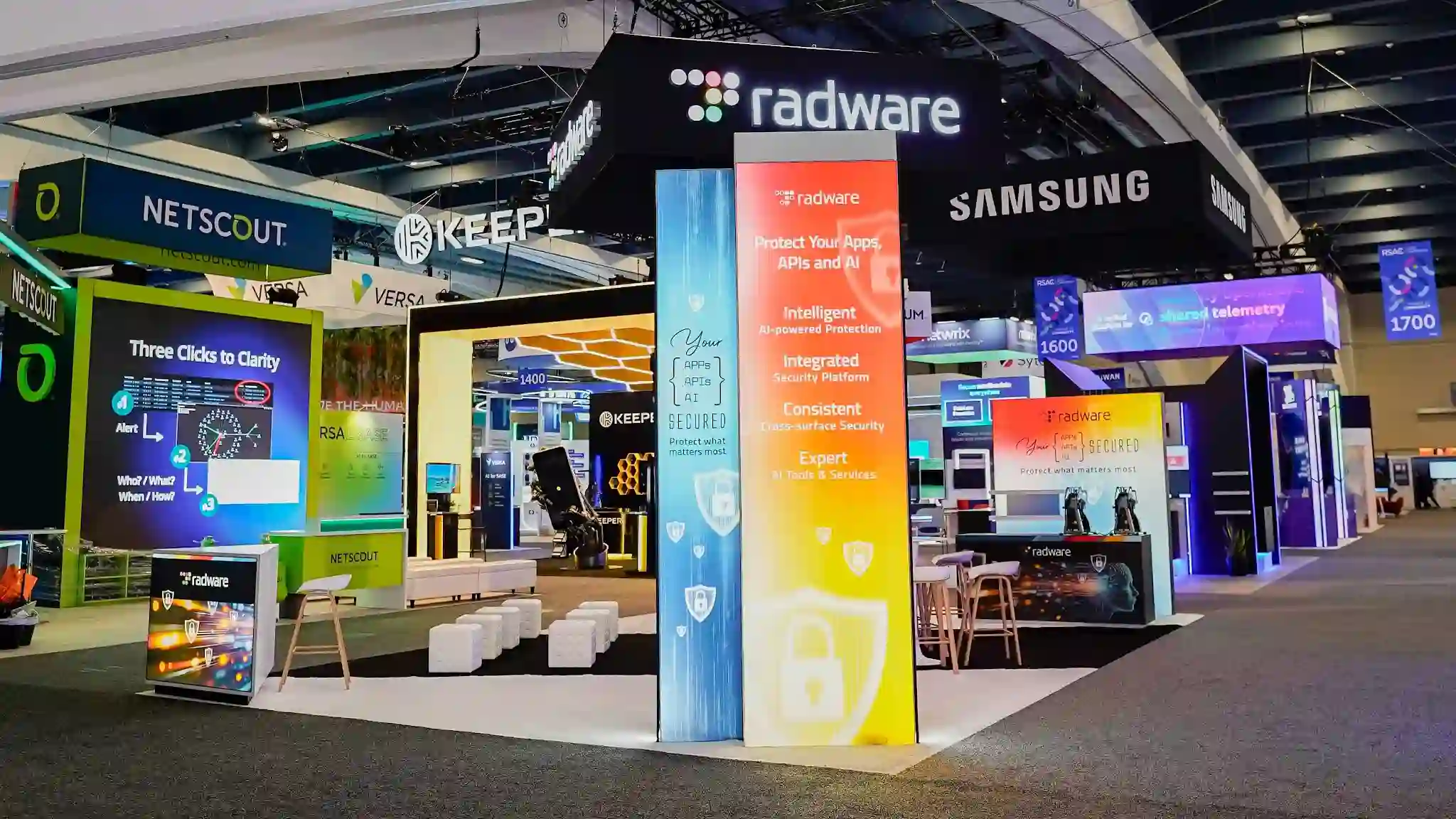
Where color became a security argument — Radware’s multicolor LED gateway arch turned a 20×30 island at RSA 2026 into the most chromatic, kinetic, and unmissable exhibit on the Moscone South floor
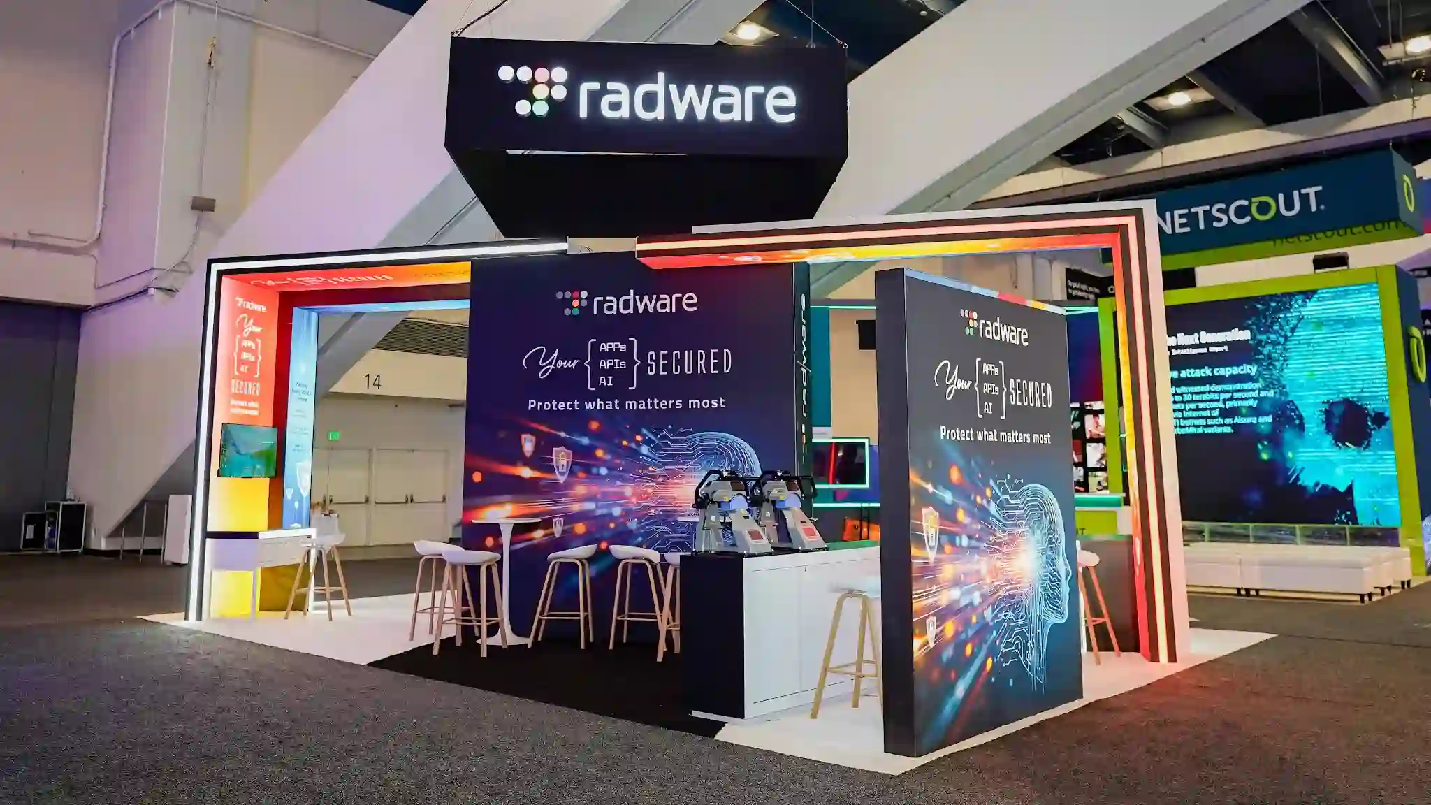
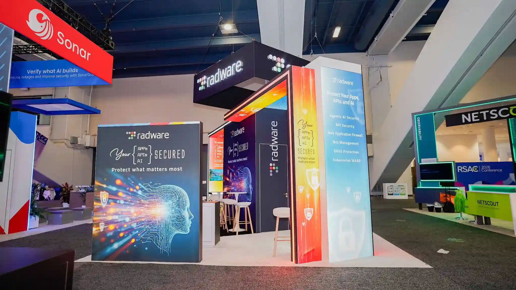
Pure Exhibits designed and built Radware’s custom 20×30 ft island exhibit at RSA Conference 2026 — Booth #S-1627 in the South Expo of Moscone Center, San Francisco, March 23–26, 2026 — anchored by a dramatic multicolor RGB LED gateway arch portal with a red–orange–yellow gradient across the top and teal sides, a tall internally-illuminated multicolor gradient lightbox pillar carrying the Intelligent/Integrated/Consistent/Expert value framework, a central LED video wall theater with white cube ottomans, a white raised platform with cyan LED underlighting that created a floating-stage effect, and the bold code-bracket typography “{APPs / APIs / AI} SECURED” speaking directly to the technical audiences who define the RSA show floor.
The Challenge
Commanding Attention — and Rewriting Cybersecurity’s Visual Language — at RSA 2026
Radware arrived at RSA Conference 2026 carrying two distinct mandates simultaneously: evolve the brand’s physical presence beyond the pop-culture narrative that had defined their previous conference appearance, and communicate a deepened six-product portfolio — now including Agentic AI Security, API Security, Web Application Firewall, Bot Management, DDoS Protection, and Kubernetes WAAP — to an audience of 45,000+ cybersecurity professionals who had seen every booth concept the industry had to offer. The previous year, Radware’s Stranger Things-themed all-white island at RSA 2025 had generated significant attention with its “Stranger Threats / Stronger Protection” campaign, cracked-wall aesthetics, and pure-white architectural drama. RSA 2026 demanded something categorically different: a design language that could carry Radware into the Agentic AI era with the same boldness, but with color, light, and architecture as the primary storytelling tools rather than cultural reference.
The competition on the South Expo floor was formidable. RSA Conference draws the largest concentration of cybersecurity decision-makers on the planet — CrowdStrike, Cisco, Fortinet, Google Cloud, and hundreds of other vendors all competing for the attention of CISOs, security architects, and SOC leaders who have perfected the art of walking past booths without stopping. In this environment, Radware’s challenge was both visual and conceptual: how does a company whose 2026 Global Threat Analysis reports Network DDoS attacks up 168% and Application layer attacks up 128% communicate genuine urgency without falling into the fear-and-darkness aesthetic that makes cybersecurity booths feel intimidating rather than inviting? And how does a platform that protects 12,500+ enterprise and carrier customers worldwide make six distinct product lines feel coherent rather than scattered across a 600-square-foot island?
The answer Pure Exhibits and Radware arrived at was architectural chromatics: a design system in which color itself — vivid, joyful, technically precise color — did the heavy communicative lifting. Rather than dark panels and aggressive typography, the booth would be a physical argument that cybersecurity protection can feel vibrant, approachable, and even beautiful. The “{APPs / APIs / AI} SECURED” campaign tagline, rendered in developer-syntax curly-bracket notation, would speak directly to the technical audiences who define RSA, while the multicolor LED arch, gradient pillar, and glowing white platform would ensure that Radware’s island was visible — and unmistakable — from every aisle approach in the South Expo.
“Don’t let scary cyber threats turn your business upside down — protect your apps, APIs, and AI with intelligence, integration, and expertise.”
— Radware Brand Platform, RSA Conference 2026
Creative Journey
The Design Story
The Chromatic Gateway
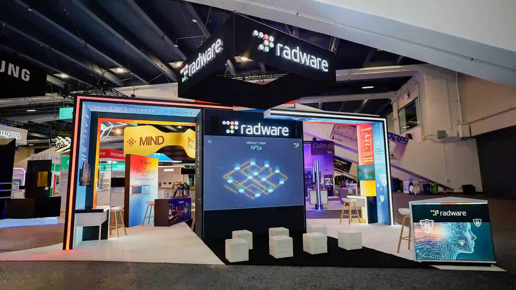
The defining architectural gesture of Radware’s RSA 2026 presence — the element that made the booth identifiable from every aisle approach in the Moscone South Expo — was the multicolor RGB LED gateway arch portal that formed the island’s primary entrance. Approximately 10–12 feet tall and 8 feet wide, the rectangular gateway was constructed with modular LED strip borders on all four sides, programmed to a specific chromatic logic: the top horizontal bar transitioned from a vivid fire-red (#FF2020) through warm orange (#FF7000) to golden yellow (#FFD500), while both vertical sides carried a calm teal-cyan (#00CED1) — a deliberate warm–cool tension that echoed the Radware dot-grid logo’s own multi-color spectrum. The arch wasn’t merely a decorative frame; it was a physical threshold, a chromatic portal that separated the grey convention aisle from Radware’s vivid interior world. Walking through it, visitors crossed from the undifferentiated noise of the show floor into a space defined by color, light, and architectural intention — the cybersecurity platform, made visible. The warm-to-cool gradient further communicated Radware’s dual mandate: the red-orange urgency of active threat response above, the teal clarity of integrated protection on the sides — a color argument for a company that secures apps, APIs, and AI simultaneously.
The Value Pillar
Standing approximately 10 feet tall and 2–3 feet wide at the right flank of the LED arch, the multicolor gradient lightbox pillar was the single most visually arresting static element on the RSA 2026 South Expo floor — a bold, internally-illuminated column whose gradient palette (deep red at the top, transitioning through sky blue and aqua, then warm golden yellow and safety orange toward the base) glowed from within with the intensity of a stained-glass window. The pillar’s graphic hierarchy was a masterclass in sequential messaging: the Radware dot-grid logo and “Protect Your Apps, APIs and AI” headline anchored the top; the four-attribute value framework — Intelligent (AI-powered Protection), Integrated (Security Platform), Consistent (Cross-surface Security), Expert (AI Tools & Services) — marched down the column in bold sans-serif type against the shifting color background; and the lower section resolved into the “{APPs / APIs / AI} SECURED” campaign typography and white shield/padlock icons on the warm yellow-orange gradient. In an industry where every vendor claims intelligence and integration, Radware’s four-attribute framework presented those claims not as text on a banner but as the literal structure of a luminous architectural monument — impossible to dismiss, impossible to walk past without reading.
The LED Theater
At the geometric center of the booth’s interior, mounted on a dark structural column visible through the LED arch gateway from the aisle, the large-format LED video wall served as the booth’s primary content engine and its most effective crowd-gathering tool. Approximately 6–8 feet wide and 5–6 feet tall, the panel displayed animated content loops — the Radware logo, “AI” subheading, “PROTECT YOUR APIs” in large type, and an interconnected glowing gold lattice network visualization on deep navy blue — that were legible from the aisle through the arch gateway, creating a visual pull that drew attendees into the booth’s interior before they had consciously decided to engage. Arranged in a semicircle in front of the LED wall, approximately six white cube ottomans created an informal theater-in-the-round: a gathering space where visitors could sit, watch a demo loop, and be approached by Radware’s sales team in a relaxed, non-confrontational environment. Placed strategically both on the white platform and in the aisle outside the booth boundary, the cube ottomans effectively extended Radware’s territory into the shared convention floor — a clever traffic-management strategy that invited passersby to pause without requiring them to commit to entering the booth.
The Dual-Wing Architecture
The interior of Radware’s 20×30 island revealed a U-shaped layout that only became fully legible once a visitor had passed through the LED arch gateway — a spatial surprise that rewarded engagement with a second, richer layer of visual experience. The booth’s interior was organized into two distinct color wings flanking the central LED video wall: a left wing suffused in warm oranges, yellows, and reds through vivid graphic wrap panels that telegraphed urgency and heat; a right wing tempered by soft purple-lavender and cool teal-aqua panels that communicated calm, precision, and structural integrity. This warm–cool interior duality was not accidental — it mapped directly to Radware’s security philosophy, where the company must simultaneously respond to active, high-urgency threats (the warm left wing: DDoS attacks up 168%, bot traffic overwhelming e-commerce) and maintain the consistent, architecturally sound protection posture that enterprise and carrier customers depend on across every application layer (the cool right wing: API security, Kubernetes WAAP, integrated cross-surface coverage). Bar-height bistro tables with natural birch-leg stools, round white countertops, and multiple demo stations populated both wings — giving Radware’s sales and engineering teams the infrastructure to run simultaneous one-on-one conversations across the full interior while the LED theater anchored the center as a continuous content engine throughout all four days of the conference.
The Floating White Stage
One of the most technically refined details of Radware’s RSA 2026 booth — and one that only registered as truly distinctive in the context of the surrounding dark convention floor and grey aisle carpet — was the modular white raised platform that defined the booth’s entire footprint. White interlocking laminate tiles elevated the booth interior above the standard grey carpet, creating a crisp visual boundary that announced “this is Radware’s territory” without any additional signage. But the platform’s most sophisticated element was a thin cyan/ice-blue LED strip running along its base perimeter, which caused the entire white stage to appear to hover above the convention floor — a floating effect that gave the booth an almost ethereal quality when viewed from the aisle, the glowing white island suspended against the dark carpet and industrial convention ceiling rigging above. The contrast was stark and effective: while neighboring booths sat directly on carpet or used standard raised flooring without underlighting, Radware’s glowing white stage communicated that this was a booth built with the same precision and intention that goes into the company’s security architecture — every detail considered, every edge illuminated, every surface purposeful.
Code-Bracket Visual Language
The most conceptually precise element of Radware’s RSA 2026 design was also the simplest: the decision to render the campaign tagline in programming syntax notation — “{APPs / APIs / AI} SECURED” — rather than conventional marketing language. The curly brackets that frame the three protected categories are the same characters that appear in JSON objects, JavaScript function bodies, CSS rule declarations, and Python dictionaries; the forward slashes separating the terms mirror the path notation that developers read daily in API endpoint URLs. To a CISO or security architect walking the RSA show floor, this typographic choice signaled something conventional booth copy never could: Radware understands your world at the syntax level, not just the press-release level. The multicolor dot-grid logo icon — a 4×4 arrangement of circles in red, orange, yellow, green, teal, and blue that visually echoes a connected network mesh or security perimeter map — reinforced this dual identity throughout the booth: technically authoritative at close range, colorfully approachable from the aisle. Together, the code-bracket typography and dot-grid icon created a visual language that was simultaneously developer-native and consumer-beautiful, a rare combination in enterprise cybersecurity marketing that made Radware’s booth feel genuinely original rather than derivative of either tech minimalism or security fearmongering.
The interior view through Radware’s multicolor LED gateway arch at RSA Conference 2026 — revealing the central LED video wall theater with white cube ottoman gathering space, the warm orange/yellow left wing and cool purple/teal right wing, bar-height demo stations, and the dual suspended overhead signage that anchored the booth’s identity across the full South Expo floor at Moscone Center, Booth #S-1627.
Gallery
The Booth in Detail
Front-facing hero — the full booth facade with hanging sign, LED arch, and value pillar
LED arch portal — 45-degree angle showing the full warm-to-cool chromatic gradient
Interior theater view — LED video wall, cube ottoman gathering space, and dual-wing layout
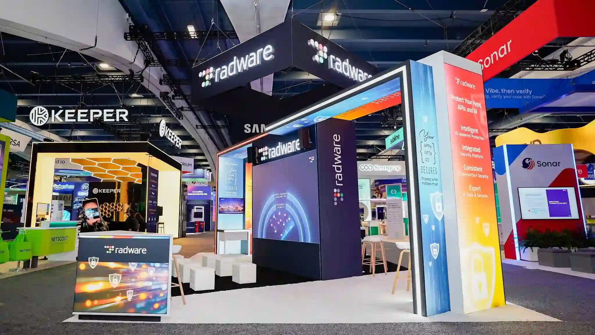
Value pillar detail — Intelligent / Integrated / Consistent / Expert framework and full product listing
Wide panoramic overview — the complete 20×30 island layout with cube ottomans and robotic demo prop
Video
Booth Walkthrough
A full walkthrough of Radware’s custom 20×30 ft island exhibit at RSA Conference 2026 — showcasing the multicolor RGB LED gateway arch portal with red–orange–yellow gradient top and teal sides, the tall internally-illuminated multicolor gradient lightbox pillar with Intelligent/Integrated/Consistent/Expert value framework, the central LED video wall theater with white cube ottoman gathering space, the dual-wing warm/cool interior layout, the white raised platform with cyan LED underlighting, and the “{APPs / APIs / AI} SECURED” code-bracket campaign typography — all at Booth #S-1627 in the Moscone Center South Expo, March 23–26, 2026.
Impact & Results
By the Numbers
From Stranger Things to Chromatic Architecture. The Evolution of Radware’s Conference Identity.
The design arc between Radware’s RSA 2025 booth and RSA 2026 represents one of the most deliberate and coherent brand evolutions in recent cybersecurity trade show history. At RSA 2025, Pure Exhibits built Radware an all-white 20×30 island anchored by a “Stranger Threats / Stronger Protection” campaign that borrowed the visual grammar of the Stranger Things universe — cracked walls suggesting dimensional breaches, the stark contrast of pure white against dark threat imagery — to make cybersecurity feel culturally resonant and narratively compelling. The booth was a masterclass in pop-culture translation: it met attendees in the language of entertainment and then pivoted to the language of security. For RSA 2026, Radware and Pure Exhibits made a more architecturally ambitious choice: instead of borrowing the authority of an existing cultural reference, build an entirely original visual world from the raw material of color, light, and developer syntax. The multicolor LED gateway arch, the glowing gradient pillar, the floating white stage, the code-bracket campaign typography — none of these referenced anything outside Radware’s own design system. They were Radware, distilled into physical form.
The strategic context made this evolution both necessary and timely. Radware’s 2026 Global Threat Analysis documented a threat landscape growing in both volume and sophistication — Network DDoS attacks up 168%, Application layer attacks up 128%, 57% of e-commerce traffic from automated bots — and the company’s expanded portfolio now included Agentic AI Security alongside its established API Security, WAF, Bot Management, DDoS Protection, and Kubernetes WAAP capabilities. Communicating six distinct product lines to an audience of 45,000+ cybersecurity professionals at RSA Conference required a design system that could hold multiple messages simultaneously without fragmenting into incoherence. The booth’s architectural solution was elegant: the gradient lightbox pillar carried the portfolio, the LED arch carried the emotional statement, the dual-wing interior carried the engagement zones, and the code-bracket campaign typography unified all of it under a single, technically precise brand voice. Every element contributed to the same argument: Radware protects what matters most, intelligently, integrally, and consistently, across every surface where your applications, APIs, and AI operate.
The RSA 2026 booth also demonstrated Pure Exhibits’ continued commitment to building cybersecurity exhibits that challenge the industry’s visual defaults. Alongside Radware’s chromatic island, the team built SpyCloud’s RSA 2026 exhibit, and in the preceding conference season completed Teramind’s 30×60 Diamond Sponsor island at RSA 2025 with its warm blonde wood arches and tropical greenery, and Appdome’s exhibit at Black Hat 2025. Each of these builds started from the same question: what design language tells this company’s specific security story with the most authenticity and physical impact? For Radware at RSA 2026, the answer was color itself — bold, joyful, architecturally precise chromatic color — turned into a portal, a pillar, a stage, and a campaign that made cybersecurity feel not dark and threatening, but vivid, capable, and alive.
More Case Studies
Explore Our Cybersecurity Portfolio
RSA 2025
Radware
20×30 all-white island with “Stranger Threats” Stranger Things-themed cracked-wall creative at RSA Conference 2025
RSA 2026
SpyCloud
Custom island exhibit at RSA Conference 2026, Moscone Center South Expo
RSA 2025
Teramind
30×60 Diamond Sponsor island with blonde wood arch gateways, tropical plants, and in-booth theater at RSA 2025
Black Hat 2025
Appdome
Custom island exhibit at Black Hat USA 2025 in Las Vegas
Black Hat 2025
SpyCloud
Cosmic-themed island booth at Black Hat USA 2025 in Las Vegas
HR Tech 2025
Zoho
Custom exhibit at HR Technology Conference 2025
Ready to Build Your Award-Winning Booth?
Pure Exhibits designs and builds custom trade show exhibits for cybersecurity companies, tech brands, and enterprise organizations nationwide — from RSA Conference and Black Hat to CES, NAB, and beyond. From 10×10 inline booths to 30×60 Diamond Sponsor islands, we handle everything from concept through breakdown.