
Pigeon
Where sixty-seven years of baby-first science descended on Las Vegas and turned a 600-square-foot island into the most trusted corner of the convention floor.
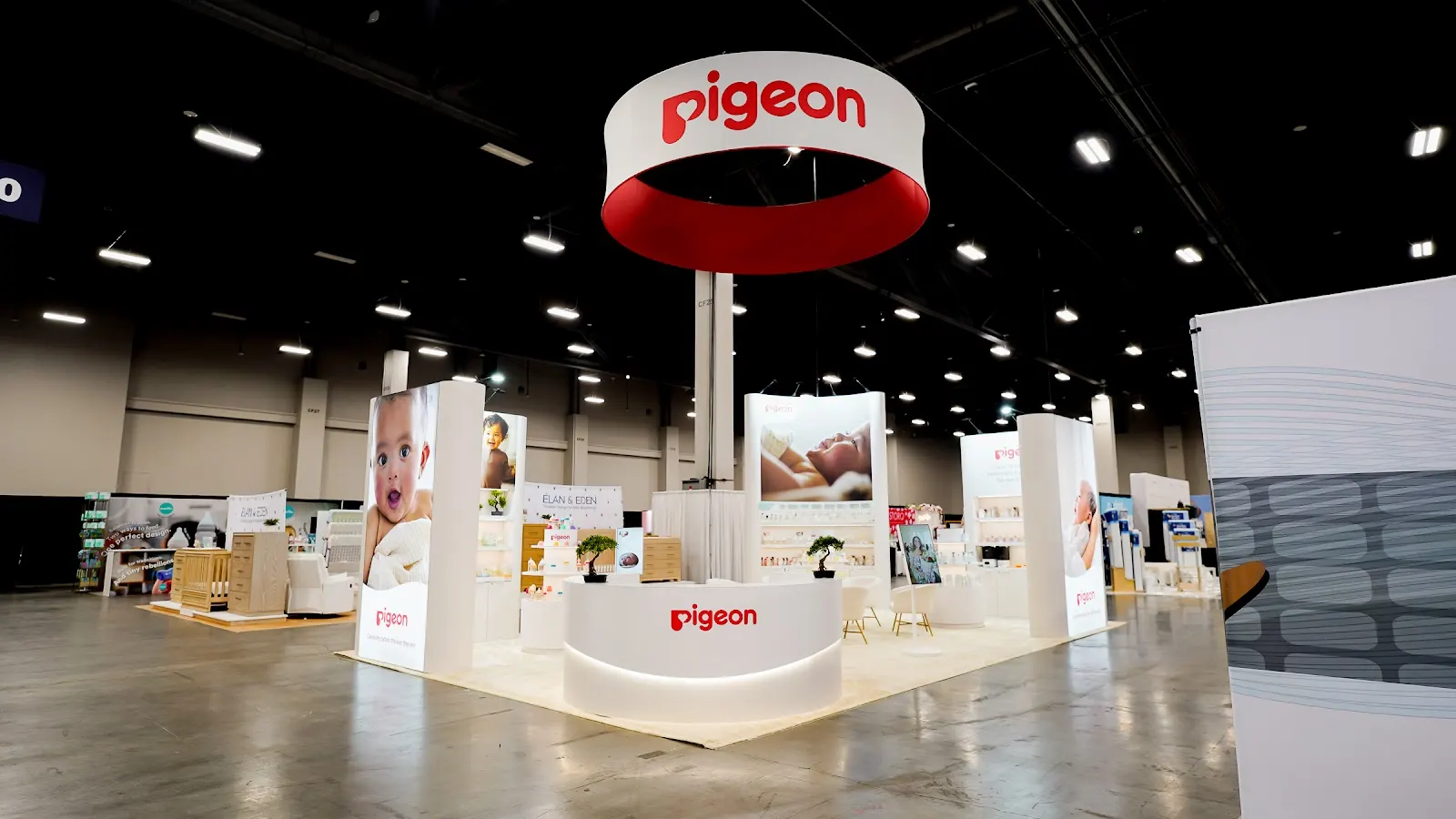
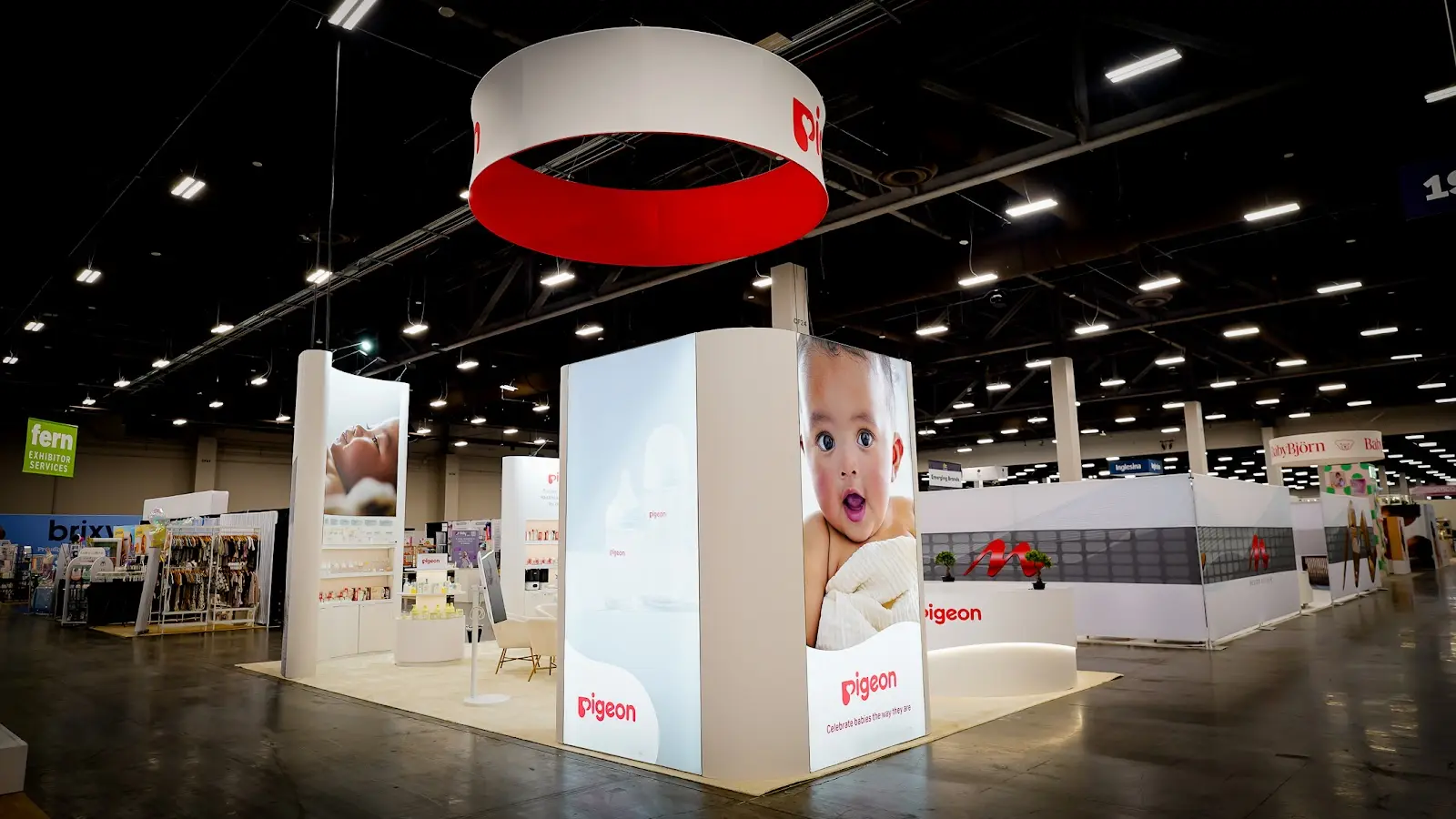
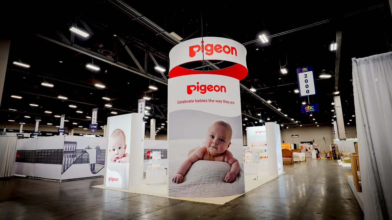
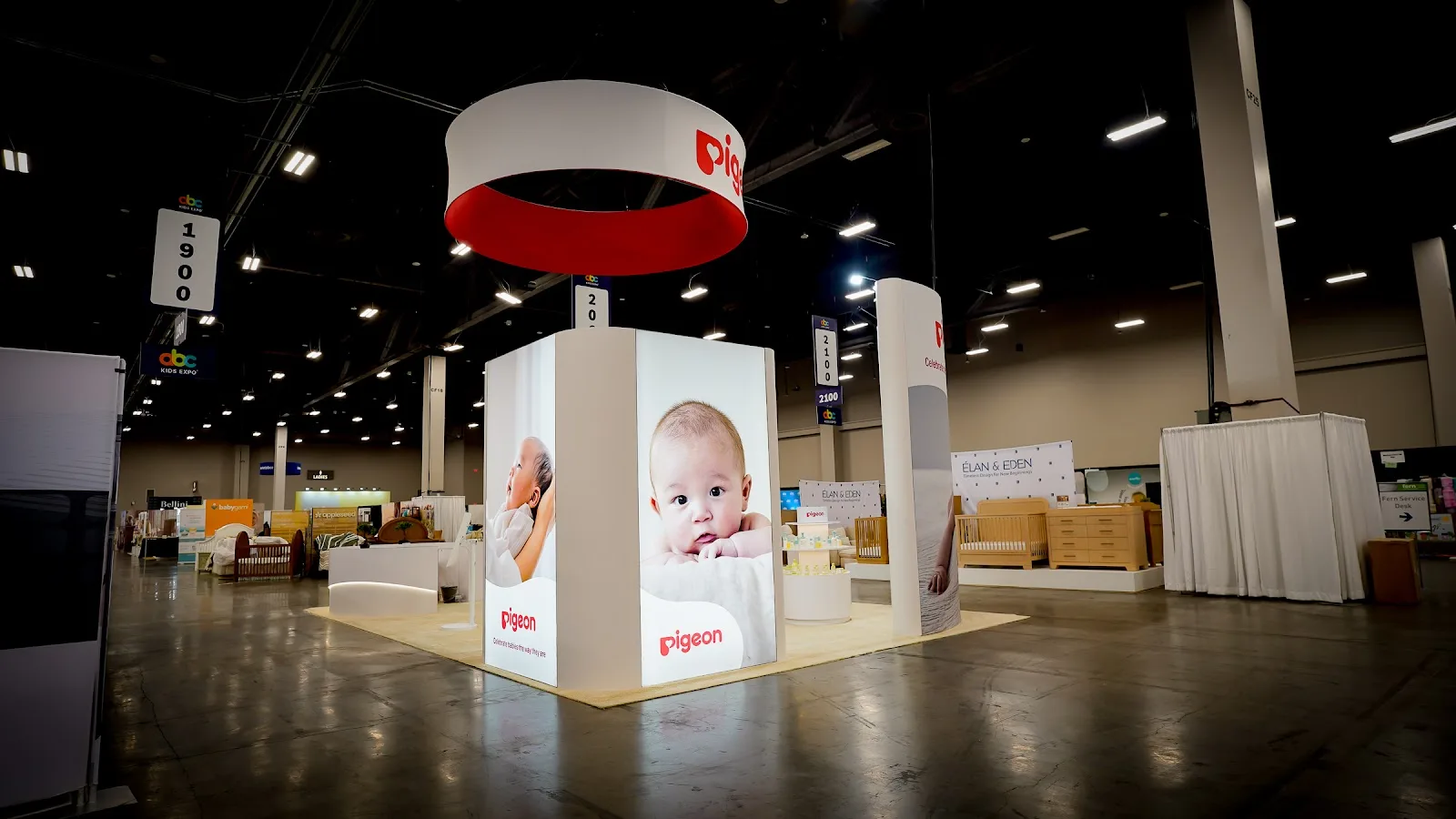
At the heart of Mandalay Bay’s sprawling exhibition hall during ABC Kids Expo 2026, Pigeon’s 20 × 30 custom island booth announced itself with the quiet authority of a brand that has never needed to shout. The structure was anchored by a dramatic overhead hanging sign bearing the Pigeon logo in clean white against the brand’s signature blue, visible across the full width of the floor and drawing buyers from every aisle. Below, a meticulously planned open-plan layout welcomed visitors without barriers — wide entry points on all four sides dissolving the boundary between booth and audience. The perimeter walls were dressed in precision-engineered white shelving that displayed Pigeon’s full product spectrum: feeding bottles engineered around the peristaltic movement of an infant’s tongue, gentle skincare formulated for newborn sensitivity, and oral care developed for every stage of early development. Interactive demo zones occupied the interior, each station lit with warm directional lighting that softened the clinical precision of the science behind every product, making the space feel as much like a nursery consultation room as a trade show exhibit. A raised platform running the length of the rear section lent the installation architectural presence — elevating featured product lines and reinforcing Pigeon’s position as a brand that stands above the category noise. Every surface, from the gloss-white product plinths to the backlit brand panels, adhered to Pigeon’s clean blue-and-white palette, creating a cohesive visual world that communicated both scientific rigor and parental warmth in a single, sweeping impression.
Bridging a 67-Year Japanese Legacy and the Expectations of North America’s Most Discerning Baby Products Buyers
Pigeon’s challenge at ABC Kids Expo 2026 was deceptively complex. The brand arrived in Las Vegas carrying one of the most decorated scientific heritages in infant care — a history stretching back to 1957, when founder Yuichi Nakata began studying the precise peristaltic movements of a nursing infant’s tongue in order to engineer the world’s first anatomically accurate bottle nipple. In Japan, in Southeast Asia, across the 40 countries where Pigeon products are distributed, that story is already understood. Parents and pediatricians alike have spent decades building trust in the brand’s methodology. But ABC Kids Expo, North America’s largest juvenile products trade show, draws a uniquely demanding audience: US retail buyers, independent specialty store owners, and wholesale decision-makers who are simultaneously evaluating hundreds of brands in a compressed three-day window, and who bring with them deeply American expectations about how a premium baby brand should present itself — expectations shaped less by laboratory credibility and more by tactile warmth, accessibility, and the reassuring ease of the premium mass-market baby category.
The dual demand was therefore this: Pigeon needed to tell its science story — a story genuinely unlike anything else on the ABC Kids floor, rooted in biomechanical research and peer-reviewed infant feeding studies — without allowing that scientific authority to read as cold, inaccessible, or foreign. At the same time, the booth had to project the warmth and approachability that US buyers instinctively associate with the best baby brands, without diluting the intellectual seriousness that is, in fact, Pigeon’s greatest competitive asset. In short, the exhibit had to feel like a conversation between a world-class researcher and a loving parent — and it had to do so in 600 square feet, in under four seconds of first impression, in a convention hall competing for attention with more than 320 other exhibiting brands.
“We exist to give every baby the best possible start — products developed not from convention, but from an intimate understanding of how infants actually experience the world.”Pigeon Corporation — Founding Ethos, 1957
Designing a Booth That Thinks Like a Scientist and Feels Like a Parent
The Heritage Wall
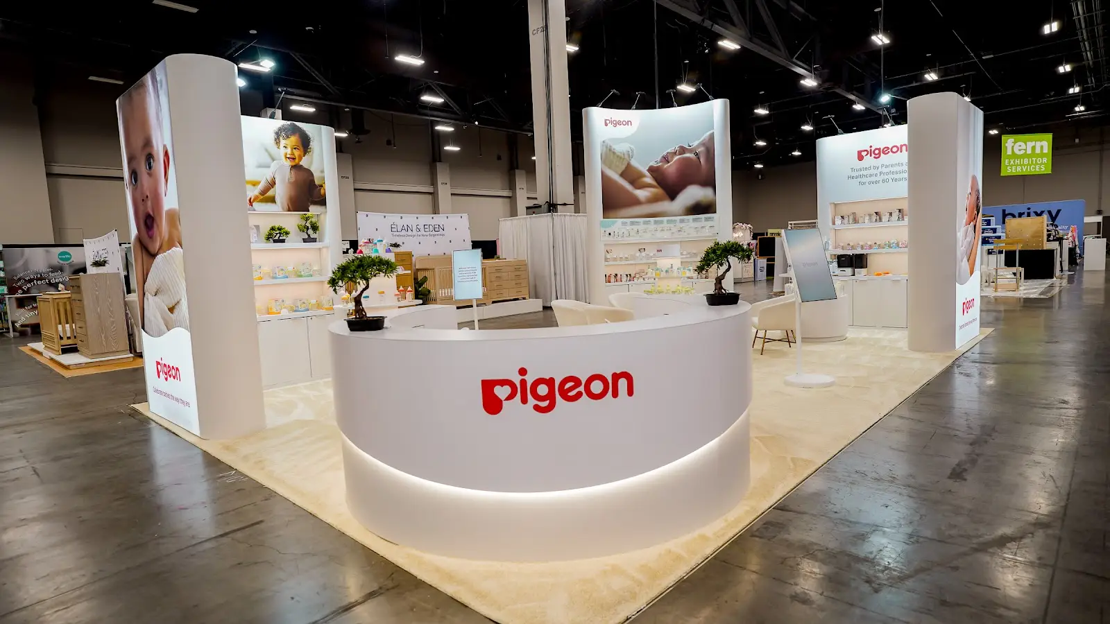
The back wall of the booth functioned as both product display and brand autobiography. Large-format panels traced the arc of Pigeon’s 67-year history — from Nakata’s original peristaltic research sketches in 1950s Tokyo to today’s globally distributed product family — while the shelving in front held the physical expression of that research: bottles, nipples, and skincare arranged not by SKU but by developmental stage, so that the display itself told the story of a child growing through the Pigeon ecosystem from birth through toddlerhood. The wall created an immediate point of differentiation from every neighboring booth, offering US buyers something they rarely encounter at ABC Kids: a brand narrative with genuine scientific depth and emotional resonance in equal measure.
The Science of Feeding
Pigeon’s founding research — the biomechanical study of peristaltic tongue movement in nursing infants — formed the conceptual backbone of the booth’s design language. Graphic elements abstracted from the soft rhythmic curves of a feeding nipple appeared throughout: in the gentle arcs of the overhead signage, in the rounded corners of every display module, and in the soft gradient wash of the brand’s blue that moved across the booth’s rear panels. The intention was to communicate, without a single word of explanation, that every design decision in this space was rooted in an understanding of infant physiology — that the booth itself thought the way Pigeon’s products think.
The Warm Welcome
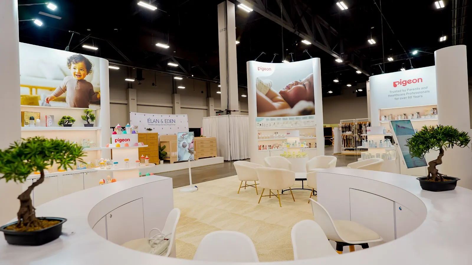
Lighting architecture was one of the booth’s most deliberate emotional tools. Rather than the flat, uniform wash typical of convention booths, Pure Exhibits’ design team specified warm directional spotlighting over each product station, creating the kind of intimate, considered glow more commonly associated with a premium retail environment or a well-designed pediatric consultation room. The open perimeter — no walls above waist height on any approach side — ensured that the warm interior light spilled outward, beckoning visitors from the aisle before they consciously registered the Pigeon name. It was the difference between a booth that says “come in if you’re already interested” and one that earns that interest at ten paces.
The Product Universe
With product lines spanning feeding, skincare, oral care, and maternity — each backed by independent clinical research — Pigeon’s catalogue breadth presented both an opportunity and a design challenge. The solution was interactive shelving organized not by product category in the conventional trade show sense, but by the journey of the child: newborn feeding at one end, transitional weaning tools in the middle, toddler oral care and beyond at the far end. Buyers could physically walk the developmental arc, picking up, examining, and comparing products at each stage. This experiential choreography transformed what might have been an overwhelming product wall into an intuitive, guided narrative — one that made the depth of the Pigeon range feel like a strength rather than a complexity.
The Raised Stage
A raised platform running along the booth’s rear and side sections introduced a vertical dimension that most island exhibits at this scale never attempt. The elevation — subtle but architecturally deliberate — served two functions simultaneously. For visitors inside the booth, it defined the premium product presentation zone as a place of slightly heightened attention, the way a stage directs focus in a theater. For visitors in the surrounding aisles, it made the booth’s interior visible above the shoulder-height visual clutter of adjacent exhibits, offering a clear sightline to Pigeon’s products and brand materials from twenty to thirty feet away. The platform also provided the Pure Exhibits installation team with a structural anchor point for the cable-supported overhead signage system above.
The Overhead Beacon
In a hall containing more than 320 exhibiting brands at ABC Kids 2026, the overhead hanging sign is the first competitive advantage — and the most ruthlessly evaluated. Pigeon’s sign was designed for maximum legibility at distance: the brand mark rendered in clean white against a deep Pigeon blue ground, with a dimensional quality achieved through precision-routed lettering and LED edge-lighting that made it read as three-dimensional even from the hall’s entrance. The sign’s geometry complemented the booth’s rectangular footprint without simply mirroring it, introducing a subtle visual tension that caught the eye more reliably than a sign that merely matched what was below. In the competitive ecology of the trade show floor, it functioned exactly as intended: as a lighthouse for every buyer in the room who deals in baby products.
The Booth in Detail
Product display detail — Pigeon’s feeding collection presented along the structured white shelving wall, each item positioned to communicate both product quality and brand consistency.
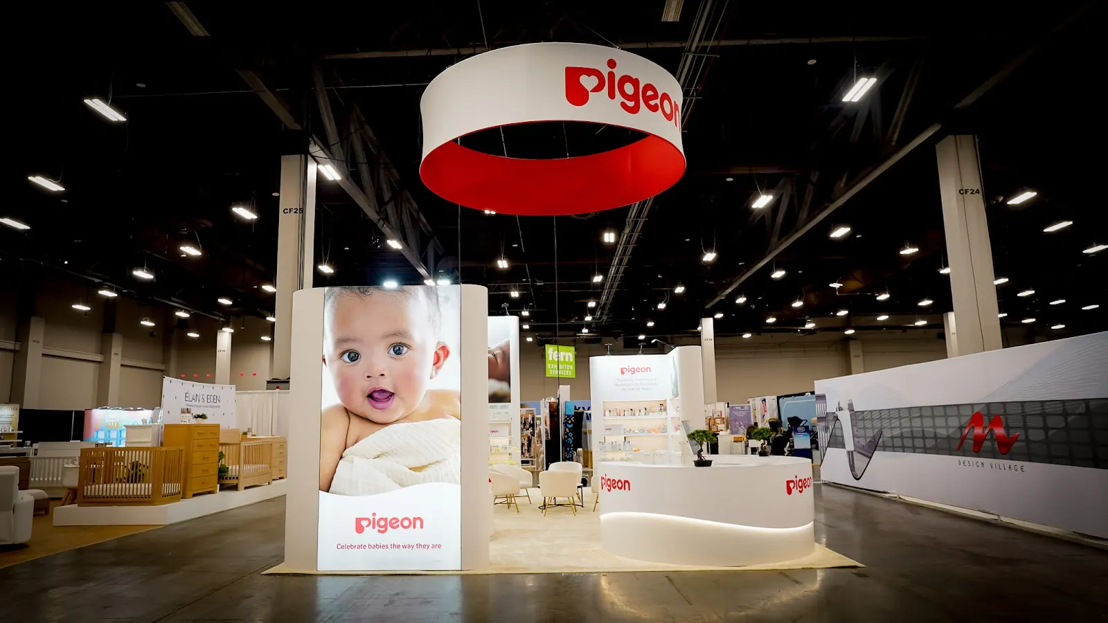
Approach view from the main aisle — the open perimeter and overhead beacon creating immediate brand recognition and drawing visitors into the Pigeon experience from distance.
Full booth overview — the 20 × 30 island at capacity, demonstrating how every design element from lighting to shelving to signage works in concert to build a single, coherent brand environment.
Raised platform and interaction zone — the elevated rear section and staffed demo stations where trade buyers engaged directly with the science behind Pigeon’s feeding technology.
Experience the Booth
A full walkthrough of the Pigeon island exhibit at ABC Kids Expo 2026 — moving through the open entry, past the heritage wall and interactive product shelving, into the demo zone, and up onto the raised platform, capturing the spatial experience that 3,000 + attendees encountered across three days in Las Vegas.
By the Numbers
A Platform for North American Market Leadership
ABC Kids Expo is not merely the largest juvenile products trade show in North America — it is the primary commercial event at which the US specialty baby market makes its buying decisions for the year ahead. For Pigeon, arriving at this event with a custom 20 × 30 island exhibit represented a categorical statement of intent: this is a brand investing in the North American channel at a level that demands to be taken seriously. The booth’s scale, finish quality, and experiential depth positioned Pigeon not as a new entrant feeling its way into an unfamiliar market, but as a global category leader claiming its rightful place among the most distinguished exhibitors on the floor. The exhibit’s design worked specifically to bridge the gap between Pigeon’s formidable scientific heritage and the warm, approachable register that resonates with American retail buyers — a balance that Pure Exhibits’ team achieved through every material, lighting, and spatial decision made in the months of preparation preceding the show. You can see a similarly rigorous approach to science-meets-brand storytelling in our work on the Chase NADA 2026 exhibit, where a world-class financial brand required the same fusion of institutional credibility and human warmth.
The significance of Pigeon’s ABC Kids presence extends beyond a single three-day show. Trade show performance at this level creates pipeline — it initiates relationships with retail buyers, specialty distributors, and category managers who will carry those impressions into conversations with their own buying committees for months afterward. For a brand with 67 years of peer-reviewed research behind it and distribution across more than 40 countries, the North American specialty channel represents one of the few remaining high-value markets where the brand’s full credentials have not yet been fully recognized. The Las Vegas exhibit was designed to begin that recognition process — to give every buyer who walked through it a reason to investigate further, to place a first order, or to revisit a conversation that may have stalled. The result was a booth that functioned simultaneously as showroom, brand museum, and the most compelling argument Pigeon has ever made on American soil for why its products belong in every US specialty nursery retailer’s range. For another example of how we help exhibitors build lasting market authority through design, see our case study on WE3DS at RSA 2026, where a specialized technology brand used a custom island to establish category leadership in a competitive field.
Explore Our Consumer Brand Portfolio
A 20 × 30 custom island exhibit for Chase at NADA 2026 — where one of America’s most trusted financial institutions needed to project authority and warmth in equal measure to automotive retail decision-makers.
View Case Study → RSA 2026 WE3DSA custom island exhibit for WE3DS at RSA Conference 2026 — a specialized cybersecurity brand using architectural design to establish category leadership among the world’s most sophisticated security professionals.
View Case Study → RSA 2026 AppdomeA 20 × 30 island with a massive overhead hanging sign for Appdome at RSA 2026 — engineering maximum floor-level visibility for a mobile security brand breaking through in a crowded market.
View Case Study → RSA 2025 TeramindA 30 × 60 Diamond Sponsor island exhibit for Teramind at RSA 2025 — one of the largest custom installations at the conference, designed to match the brand’s ambition and accelerate its enterprise sales pipeline.
View Case Study →Let’s Build Your Next Booth
Pure Exhibits designs and builds custom trade show exhibits for consumer brands, baby product companies, and retail organizations nationwide. From 10 × 10 inline displays to 30 × 60 island environments, every exhibit we produce is engineered around a single ambition: making your brand the most compelling presence in the room. Whether you’re entering a new market, refreshing an aging exhibit, or building your first custom structure from the ground up, our team brings the same depth of design thinking that shaped Pigeon’s ABC Kids experience — and the same commitment to your commercial outcomes.