
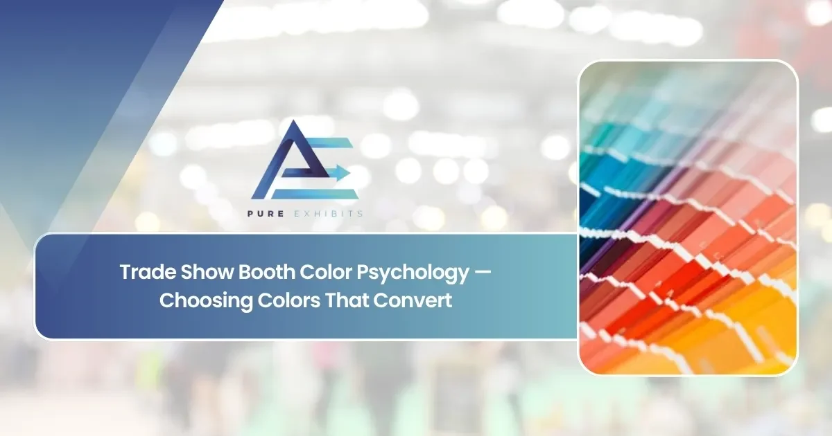
Color is one of the first elements that an attendee walking by will notice about the booth, perhaps even before he or she recognizes your brand, the product you offer, or any other information. Trade show booth color psychology refers to the deliberate choice of colors based on their influence on perception, mood, and behavior, instead of just picking colors that seem nice to the eye.
The right color scheme will help your booth to stand out among your competitors at the exhibition and promote your brand, as well as encourage visitors’ behavior by attracting them towards a certain place in the booth. On the contrary, poor choices can make even an excellent booth look dull and send subconscious signals about your company to attendees.
This guide will cover the psychological characteristics of typical colors used in booths, how to pick the right balance between your brand colors and accent colors, and how to choose your colors depending on the size of your booth and other conditions.
Color strategy connects directly to the broader visual choices covered in Pure Exhibits’ trade show graphics guide, since color and graphic design decisions need to reinforce each other rather than compete for attention.
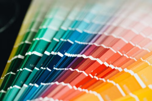
Trade Show Booth Color Psychology: Why Does Color Matter So Much on the Floor?
On a crowded show floor, attendees make split-second decisions about which booths to approach. Color is processed faster than text or even shape, which means it plays an outsized role in whether a booth catches an attendee’s eye in the first place.
Color also carries emotional and psychological associations that affect how a brand is perceived, even before a visitor reads a single word of messaging. Choosing colors without considering these associations risks sending a message that’s inconsistent with the brand’s actual positioning.
Common Color Associations in Booth Design
| Color | Common Psychological Association |
|---|---|
| Blue | Trust, stability, professionalism |
| Red | Energy, urgency, excitement |
| Orange | Approachability, confidence, action |
| Green | Growth, sustainability, calm |
| Black/dark neutrals | Premium, sophistication, focus |
Pure Exhibits builds booth color strategy into every design. Let’s make sure your colors work as hard as your booth does.
The “Sea of Blue” Problem: Why Safe Colors Can Backfire
Here’s the part of color psychology marketing that most booth design content skips entirely: color psychology isn’t just about what a color means in isolation. It’s about what a color means relative to the floor you’re standing on.
Just go through the floor of any B2B trade show, and you’ll see tons of booths using the color blue. The color blue is the statistically safest option exactly because everybody else has made the same conclusion – which also means that an average booth that’s blue-on-white, well-designed, but very similar visually to the other dozen booths around will have to do much more to actually stop people from coming to it, no matter how much “trust” you get by choosing the color blue.
This is the true strategic conclusion that is missing in almost all articles about color psychology, and it says that the right color is not the one with the best psychological meaning within your industry. It’s the one that gives maximum contrast against what your specific competitors might use at the same trade show. For example, a healthcare company that breaks the tradition of using pale blue and goes with deep green or elegant black and white colors with accents will probably perform better than a booth using “brand-consistent” blue.
Before finalizing your exhibit color scheme, walk the floor plan or look at past years’ exhibitor photos for your specific show. If your category has converged on a color, that’s valuable information. Sometimes the move is to lean into it for trust signaling, and sometimes the smarter move is to deliberately stand apart.
Color Combinations That Actually Work
The 60-30-10 ratio is a dependable place to begin: 60% of the space in your booth with the dominant color, 30% with the secondary color that supports the first one, and the remaining 10% with an accent color in a striking hue employed selectively for the most important call-to-action point in your booth.
-
A complementary color combination consists of colors that are positioned directly opposite one another on the wheel, for example, blue/orange or purple/yellow combinations. They are very high in contrast and visual dynamics; when applied thoughtfully, they will draw attention to all the focal points in your booth design, but overused and spread over a wide area, they may look overwhelming.
-
In contrast to complementary color schemes, analogous color schemes combine two colors located side by side on the wheel, for example, blue/green or red/orange combinations. They will look cohesive and harmonized; compared to the complementary color combinations, they will look more sophisticated and professional, so they are great for professional-looking booths.
-
High-contrast text and background combinations (dark text on light background, or the reverse) are non-negotiable for readability from a distance. This matters more than almost any color-meaning consideration, since a beautifully chosen color palette is worthless if your core message can’t be read from 20 feet away.
How Should Brand Color and Accent Color Be Balanced?
Most booths should lead with their established brand colors for recognition, then use a smaller set of accent colors strategically to draw attention to specific areas like a demo station or call to action, a balance covered further in Pure Exhibits’ trade show booth design guide, where accent placement is treated as a deliberate design decision rather than an afterthought.
Using too many colors at once dilutes the visual impact of any single one, while relying entirely on brand color without any accent can make important areas of the booth blend in rather than stand out.
Brand Color vs. Accent Color Usage
| Color Role | Typical Usage | Coverage of Booth |
|---|---|---|
| Primary brand color | Backdrop, major structural elements | 60-70% |
| Secondary brand color | Supporting graphics, furniture accents | 20-30% |
| Accent/highlight color | CTAs, demo areas, key signage | 5-10% |
Not sure if your current color palette is helping or hurting your booth traffic? Pure Exhibits can help you find out.
How Does Color Strategy Differ by Booth Size?
Smaller booths, covered on Pure Exhibits’ trade show booth sizes page, benefit from a bold, simple color statement that’s visible from a distance, while larger booths can use color zoning to differentiate sections without losing overall cohesion.
Color Strategy by Booth Size
| Booth Size | Recommended Color Strategy |
|---|---|
| 10×10 | One bold, dominant color visible from a distance |
| 10×20 | Dominant color plus one strategic accent zone |
| 20×20 | Color zoning across two to three functional areas |
| 20×40+ | Full color system distinguishing multiple zones |
How Does Lighting Interact With Booth Color Choices?
Lighting can dramatically shift how a color is perceived, washing out subtle tones or intensifying bold ones, a relationship explored in Pure Exhibits’ trade show booth lighting guide, where color and lighting decisions are made together rather than independently to avoid unexpected results on the show floor.
Lighting Effects on Common Booth Colors
| Color | Effect Under Warm Lighting | Effect Under Cool Lighting |
|---|---|---|
| Blue | Can appear muted or dull | Appears crisp and vivid |
| Orange | Appears warm and energetic | Can appear slightly washed out |
| White/neutral | Appears warm, inviting | Appears clean, clinical |
From color palette to lighting plan, Pure Exhibits designs the full picture. Request a quote today.
How Do Industry Norms Affect Booth Color Choices?
Some industries carry strong color expectations. Healthcare brands often lean toward clean blues and whites, while industrial brands may use bolder, high-contrast colors tied to safety signage conventions. These norms are worth considering alongside the broader booth strategy covered in Pure Exhibits’ trade show booth strategy guide, since standing out from competitors sometimes means deliberately breaking from industry color conventions.
Industry Color Norms and Opportunities to Differentiate
| Industry | Common Color Norm | Differentiation Opportunity |
|---|---|---|
| Healthcare | Blues, whites, soft greens | A confident accent color to stand out |
| Industrial/manufacturing | Bold primary colors, high contrast | A refined, premium-feeling palette |
| Tech/SaaS | Cool blues, dark neutrals | A warm accent to feel more approachable |
What Are the Most Common Color Mistakes Exhibitors Make?
Using too many competing colors, choosing colors that clash with the venue’s ambient lighting, or picking colors that look good on screen but wash out under show-floor lighting are all common mistakes, ones that proper planning during Pure Exhibits’ trade show pre-show planning checklist process can catch well before the show.
Common Booth Color Mistakes and Fixes
| Mistake | Fix |
|---|---|
| Too many colors competing for attention | Limit to one dominant color plus one or two accents |
| Colors chosen without considering venue lighting | Test colors under show-floor-style lighting conditions |
| No accent color for key CTAs/demo areas | Add a deliberate, distinct accent for high-priority zones |
| Ignoring brand color guidelines | Anchor palette to existing brand colors for recognition |
Visit the Pure Exhibits homepage or our Las Vegas page to see how we use color strategy to make booths stand out and convert more visitors.
Trade Show Booth Color Psychology: Practical Steps for Choosing Your Exhibit Color Scheme
1. Start with your existing brand palette. Trade show booth color psychology should reinforce your brand identity, not override it. Your booth’s primary color should typically be your established brand color, with psychology guiding the secondary and accent choices around it.
2. Identify your primary booth goal. A booth built to maximize traffic volume benefits from bolder, more attention-grabbing accents. A booth built for fewer, deeper conversations (a meeting-focused strategy) can lean into calmer, more sophisticated tones that signal seriousness over urgency.
3. Check what your competitors and category typically use. Decide deliberately whether to align with category convention (for trust signaling) or break from it (for differentiation); don’t default to the same palette as everyone around you without making that choice intentionally.
4. Apply the 60-30-10 framework, and resist the temptation to add a fourth or fifth major color.
5. Test under realistic lighting, especially if you’re investing in a backlit display, before finalizing production files.
6. Keep every surface consistent: graphics, furniture, flooring, and staff attire should all reinforce the same palette rather than introducing competing colors.
How Pure Exhibits Applies Trade Show Booth Color Psychology to Exhibit Design?
Trade show booth color psychology is integrated in all designs right from the initial concept stages, not as the finishing touches but as an actual choice made based on your brand and the objective of the booth. Our in-house fabrication facility, coupled with our experience with standard and backlit display solutions, enables us to provide visual samples of how a specific color palette will work in varying lighting conditions before you approve the final graphics.
Located in Las Vegas, Pure Exhibits is experienced in designing booths for exhibitions held at the LVCC, Mandalay Bay Convention Center, Caesars Forum, and Resorts World, all places with different lighting situations.
Let’s Build Something Extraordinary
Share your event details and we’ll craft a custom booth solution designed to captivate your audience and maximize your ROI.
15 Questions About Trade Show Booth Color Psychology: Answered
What is booth color psychology?
Trade show booth color psychology is the practice of choosing booth colors deliberately based on how they affect attention, emotion, and visitor behavior, rather than choosing colors purely on visual preference.
Why does color matter so much in a crowded show floor environment?
Color is processed faster than text or shape, which means it plays an outsized role in whether a passing attendee notices and approaches a booth in the first place.
What does blue typically communicate in booth design?
Blue is commonly associated with trust, stability, and professionalism, making it a popular choice for brands wanting to project reliability.
Why is orange often used as an accent color rather than a dominant one?
Orange conveys energy and approachability effectively in smaller doses, but using it as a dominant color across an entire booth can feel overwhelming rather than inviting.
How much of a booth should be covered in the primary brand color?
A common guideline is 60-70% primary brand color, 20-30% secondary brand color, and 5-10% accent color reserved for CTAs and key focal points.
Does color strategy need to change based on booth size?
Yes, smaller booths benefit from one bold, simple color statement, while larger booths can use color zoning to distinguish different functional areas without losing cohesion.
How does lighting affect how booth colors actually look on the show floor?
Lighting can significantly shift color perception; warm lighting can mute blues while intensifying oranges, so color and lighting decisions should be made together rather than independently.
Should color choices follow industry norms or break from them?
It depends on the goal: following industry norms builds familiarity, while breaking from them can help a booth stand out, as long as the choice still feels authentic to the brand.
What’s the most common color mistake exhibitors make?
Using too many competing colors at once, which dilutes the visual impact of any single color and can make a booth feel visually chaotic rather than cohesive.
Can color help draw attention to a specific area of a booth, like a demo station?
Yes, a deliberate accent color used only in that area creates a visual cue that draws the eye, especially when the rest of the booth uses a more restrained palette.
How should color choices account for the venue’s overall lighting conditions?
Testing colors under lighting conditions similar to the show floor, rather than relying solely on how they look in a design rendering or showroom, helps avoid surprises on show day.
Does color psychology apply the same way across all industries?
Largely yes, though specific industries carry additional color associations, healthcare often leans toward blues and whites, for example, which can influence how a palette is perceived.
How does Pure Exhibits incorporate color psychology into booth design?
We start with a brand’s existing color identity, then layer in strategic accents and lighting considerations to make sure the full palette works together rather than being chosen in isolation.
Can the wrong color choice actually hurt booth performance?
Yes, colors that clash with venue lighting, dilute brand recognition, or send unintended emotional signals can make an otherwise well-designed booth underperform.
Should color decisions be made early or late in the booth design process?
Early, color should inform graphics, lighting, and material choices from the start, rather than being added as a final layer after everything else has already been designed.