Most trade show booths are visually forgettable. They display a company name, a product line, and a set of marketing claims that could apply to any of the ten competitors occupying neighboring spaces on the same aisle. Visitors walk past, glance briefly, and keep walking — because nothing about the space communicates a reason to stop, engage, or have a conversation. The booth exists. It does not perform.
A trade show brand experience is something categorically different. It is a deliberately designed environment that translates a brand’s identity — its values, personality, market position, and visual language — into a three-dimensional space that earns attention, creates a specific emotional response, and gives visitors a reason to engage. The booth is not just a backdrop for a sales conversation. It is an active participant in the conversion process, communicating credibility and differentiation before anyone speaks.
The distinction between a trade show booth and a trade show brand experience is measurable. Booths that create genuine brand experiences — ones where the design, lighting, materials, messaging hierarchy, and spatial organization all express a coherent identity — generate more unsolicited walk-in traffic, hold visitors longer, and produce more qualified leads per square foot than booths that treat exhibit design as a graphic production task. The investment in creating a real brand experience consistently pays back in lead generation outcomes.
This guide covers what a trade show brand experience requires — from design fundamentals through brand guideline translation, stand-out tactics, sponsored area integration, and conversion measurement. For companies ready to begin the design process, PureExhibits’ trade show booth design services deliver a 3D concept within 48 hours of the initial brief — built around your brand identity, not a generic template.

What Is a Trade Show Brand Experience and Why Does It Convert?
A trade show brand experience is the totality of sensory and emotional impressions a visitor receives from the moment they see a booth to the moment they leave it. It encompasses everything that communicates — the structural forms, the color fields, the scale and placement of graphic elements, the lighting tone and intensity, the materials and finishes, the spatial organization, the sounds or absence of sounds, and the staff who represent the brand within the space. In a brand experience, every one of these elements is intentional and coordinated. Nothing is incidental.
Brand experiences convert because they do something that isolated sales conversations cannot: they establish an emotional baseline before the conversation begins. When a visitor enters a well-designed exhibit and the immediate response is a feeling of quality, scale, and credibility — even before reading a single line of copy — that emotional response predisposes them to engage seriously with what the company has to say. Conversely, a booth that communicates genericness or low investment signals the same about the company itself, and sales teams work against that signal for the entire conversation.
The conversion mechanism is not primarily aesthetic — it is perceptual. Trade show visitors are sophisticated buyers making rapid assessments about which vendors merit their attention in a crowded, noisy, time-pressured environment. A brand experience that communicates clearly and confidently in the first three seconds of exposure — through scale, color impact, typographic clarity, and spatial invitation — passes the first filter. A booth that fails to communicate in that window rarely gets a second chance at that visitor’s attention during the show.
Understanding what elements of the booth are performing the conversion work — and which are decorative — requires a clarity about who the target visitor is and what they need to feel and believe before they will engage. For exhibitors building a brand experience as part of a broader trade show strategy, the design brief should include audience persona detail and the specific emotional state the exhibit is designed to create — confidence, curiosity, trust, or excitement — not just aesthetic references.
PureExhibits designs trade show brand experiences that are specific to your brand, not templated solutions that look like every other booth on the floor.
How Does Booth Design Communicate Brand Identity on a Trade Show Floor?
A trade show booth communicates brand identity through design decisions that most visitors process unconsciously but that drive their behavior at a visceral level. Color is the first and most powerful communicator — a booth whose primary color field matches the brand’s dominant hue creates immediate visual recognition for visitors who already know the brand, and signals a specific category of brand personality to those who do not. Dark, deep color fields with metallic accents communicate premium, authority, and precision. Bright, saturated colors with open spatial arrangements communicate energy, accessibility, and innovation. Muted, natural palettes with organic forms communicate sustainability, craft, and authenticity.
Structural form communicates equally powerfully. A booth with high overhead elements — a dramatic tower, a hanging sign, a full ceiling structure — signals scale and investment that creates a halo effect of credibility. A booth organized around open sightlines and clear entry points communicates confidence and accessibility. A booth with controlled access and defined meeting spaces communicates premium positioning and the expectation of a serious conversation. These architectural decisions shape the visitor’s experience and expectations before the first product claim is made.
Typography at trade show scale follows rules that differ from print or digital brand applications. Headline type must be legible at 30 feet in variable lighting conditions. Copy must be structured in a strict hierarchy — a single most-important message at maximum scale, supported by secondary messages at half that scale, with detail copy available only at close range for visitors who have chosen to approach. Brands that apply their standard typography guidelines to exhibit graphics without adjusting for scale and viewing distance consistently produce booths that are impossible to read from the aisle, which is exactly where the first impression is made.
Materials and finishes operate as brand signals in ways that printed graphics alone cannot replicate. A booth with backlit graphics, brushed aluminum accents, and polished countertop surfaces communicates a fundamentally different brand identity than one built from printed fabrics stretched over aluminum extrusions — even if both booths carry the same logo and color palette.
Trade Show Brand Experience — Design Elements and Conversion Impact
| Design Element | Brand Signal | Conversion Mechanism | Common Mistake | PureExhibits Approach |
|---|---|---|---|---|
| Color field | Brand personality, category, energy level | Immediate visual recognition; emotional baseline | Color too close to competitors in same aisle | Brand-specific Pantone matching; aisle differentiation review |
| Structural height | Scale, ambition, investment level | Halo credibility effect before conversation begins | Low profile lost in crowd; not visible from distance | Height and overhead elements in every design brief |
| Typography scale | Hierarchy, brand voice, message clarity | Readable hierarchy filters right visitors from aisle | Print-scale copy applied at exhibit scale | Exhibit-scale type hierarchy designed separately from print |
| Lighting tone | Quality, warmth, product prestige | Sets mood; product lit to maximum perceived quality | Hall lighting accepted as adequate | Professional LED designed per exhibit; standard in all rentals |
| Material quality | Market position, price point, trustworthiness | Physical quality implies product/service quality | Fabric graphics + aluminum frame at premium price | Material selection matched to brand positioning |
| Spatial organization | Accessibility vs. exclusivity; confidence | Determines visitor traffic flow and dwell time | Random furniture placement; no clear entry or path | Flow designed in 3D before fabrication begins |
How Do You Translate Corporate Brand Guidelines Into a Trade Show Exhibit?
Corporate brand guidelines are designed for two-dimensional applications — screens, print, packaging, and signage. Translating them into a three-dimensional, inhabitable brand environment requires a design discipline that most corporate brand guides do not address. The challenge is not simply reproducing the brand’s colors and fonts at large scale. It is interpreting the intent and values behind the brand guide — what the brand is trying to communicate about itself — and expressing those things in architectural and environmental forms that a physical space can produce.
Color translation from brand guide to exhibit requires attention to the physical properties of color at scale. A brand’s primary color specified as a Pantone code behaves differently when it covers a 10-foot-tall graphic panel versus a business card. Color that reads as refined and authoritative at print scale can become oppressive at exhibit scale. Color that reads as energetic at print scale can become garish at large format. The exhibit designer’s job is to apply the brand color family in proportions and across materials that produce the intended brand impression at the scale and under the lighting conditions of a convention center floor.
Typography translation requires the most deliberate adaptation. Brand fonts specified for print use at 10 to 12 points require entirely different sizing, weight, and spacing decisions when applied to exhibit graphics at 10 to 100 times that scale. Fonts that look elegant in print marketing often read as thin and weak at exhibit scale; the exhibit designer may need to use heavier weights or larger tracking than the brand guide specifies to achieve the visual quality the brand intends. These are technical judgment calls that exhibit designers with brand experience make routinely — and that production-focused vendors without design depth frequently miss.
Logo usage rules must be maintained rigorously in the exhibit environment, where the pressure to maximize logo size often leads to applications that violate the brand guide’s clear space, minimum size, and background color requirements. An exhibit that violates the company’s logo usage rules produces a brand experience that the marketing team will not approve and the legal team may flag. Exhibit partners who have the design discipline to apply logo guidelines correctly — including in unusual configurations like curved surfaces, backlit panels, and structural faces at unusual angles — eliminate this common brand compliance problem.
Brand Guidelines Translation Checklist — From Brand Book to Exhibit
| Brand Element | Source Specification | Exhibit Application | Scale Adaptation Required | Compliance Risk If Missed |
|---|---|---|---|---|
| Primary color | Pantone / CMYK / HEX code | Large-format print, structural paint, backlit film | Color weight adjustment for large area | Color mismatch; brand inconsistency |
| Secondary palette | Accent / supporting colors | Panel accents, counter surfaces, lighting wash color | Proportion decision: how much vs. primary | Palette imbalance; muddy brand read |
| Logo | Vector file + usage guide | Primary header panel, hanging sign, all visible faces | Clear space maintained at large format | Logo violation; marketing / legal rejection |
| Primary typeface | Font file + usage guide | Headline type on all graphic panels | Weight and tracking for exhibit legibility | Weak, illegible type at distance |
| Secondary typeface | Font file + hierarchy guide | Sub-headline and body copy on close-range panels | Scale + leading for standing readability | Hierarchy confusion; message lost |
| Imagery / photography | Brand photo library + usage rules | Hero panel images, product photography | Resolution check for print at exhibit scale | Pixelated images; low-quality visual impression |
| Tone / messaging | Brand voice guide + approved copy | All panel copy, digital content, staff talking points | Compression for exhibit dwell time (~3 seconds) | Off-brand messaging; legal exposure |
PureExhibits works directly from your brand guidelines, Pantone codes, font files, logo usage rules, and approved imagery to produce an exhibit that your CMO and legal team will approve the first time. Request a consultation.
How Do You Create a Brand Experience That Stands Out at Large Shows?
At a large show, the most common mistake is designing to the average. When exhibitors look at what their competitors are doing and design a booth that is comparable — similar size, similar graphic treatment, similar furniture, similar layout — they guarantee that their trade show brand experience will not stand out. The visitor’s brain processes environments by contrast. A booth that reads as distinct from its neighbors earns a second look. A booth that blends into the visual texture of the hall is essentially invisible.
Distinctiveness in a large show environment operates at three levels: visual contrast, spatial invitation, and messaging specificity. Visual contrast means that the exhibit’s dominant visual character is meaningfully different from what is around it — not just a different shade of blue, but a fundamentally different visual energy. Spatial invitation means the exhibit’s physical arrangement communicates openness, interest, and a reason to enter rather than pass by. Messaging specificity means the headline visible from the aisle says something specific and compelling to a specific type of visitor — not a generic category claim that applies equally to every competitor in the space.
The single most effective distinctiveness tool available to exhibitors at large shows is vertical scale. A booth that extends a tower or hanging sign to the maximum permitted height creates a visual anchor visible from across the hall that functions as a navigation landmark — visitors who know your brand will seek you out across a crowded floor if they can see your overhead structure above the crowd. Combining vertical scale with bold color and a clean, large-format typographic statement creates a visual signature that no amount of clever graphic detail at eye level can replicate. For available booth size and configuration options, including island configurations that permit full vertical extension, PureExhibits’ catalog covers the full range from 10×10 inline to large-format island builds.
Sound and motion are distinctiveness tools that most exhibitors underuse or misuse. Ambient sound — a subtle brand-aligned audio environment rather than aggressive promotional audio — signals a different level of curation than the silent or aggressively loud booths on either side. Motion on digital displays, when it is brand-quality content playing on commercial-grade screens at appropriate brightness, draws peripheral vision from visitors walking past. The combination of motion, sound, and light creates a multi-sensory brand experience that a static display simply cannot compete with.
Visitor Journey — How a Brand Experience Converts at Each Stage
| Journey Stage | Distance from Booth | What the Visitor Perceives | Design Element Responsible | Conversion Goal |
|---|---|---|---|---|
| First impression | 30–50 feet | Brand color, vertical scale, motion on displays | Overhead structure, LED wall, lighting | Stop walking; redirect attention to booth |
| Approach decision | 15–30 feet | Headline message, spatial openness, visual quality | Header graphic, structural form, entry point | Choose to approach; read primary message |
| Engagement threshold | 5–15 feet | Secondary messages, product images, staff body language | Panel graphics, staff positioning, kiosks | Cross into the booth space; commit to a conversation |
| Active engagement | Within booth | Product detail, brand story, staff conversation quality | Product displays, kiosk content, staff script | Qualify interest; exchange contact information |
| Exit and recall | Post-visit | Leave-behind, digital follow-up, memory of experience | Collateral, lead capture, CTA clarity | Qualified lead captured; follow-up expected |
How Do Sponsored Areas and Signage Extend Your Brand Beyond the Booth?
Most exhibitors treat the booth as the boundary of their trade show brand experience. Companies with more sophisticated programs understand that brand experience on the show floor extends to every touchpoint where the company’s name, logo, or visual identity appears — including sponsored session signage, registration area graphics, aisle banners, networking event branding, and digital touchpoints like the event app and show website. A coordinated investment across these touchpoints creates a brand saturation effect that reinforces the booth visit and builds recall between show touchpoints.
Sponsored sessions are the most high-value extension of the booth brand experience at conferences and trade shows with educational programming. A speaking session where the company’s branding is prominently integrated into the stage backdrop, lower-third graphics, and pre-session signage reaches the entire session audience — including buyers who may never walk the show floor. When the speaker’s content is genuinely useful to the audience, the brand association is positive and the implicit credibility transfer to the company’s products or services is significant. The session and the booth should be coordinated as a single brand experience: consistent visual language, consistent messaging, and a clear connection between what visitors heard in the session and what they will find at the booth.
Show signage packages — aisle banners, registration area placements, digital directory listings, and entrance graphics — extend brand visibility to the entire show audience before they reach the exhibit hall. These placements function differently from the booth: they build awareness and navigate traffic rather than creating engagement. The design of these elements should be coordinated with the booth’s visual language so that they function as a consistent system, not isolated graphics that happen to carry the same logo. A visitor who sees an aisle banner with the company’s distinctive visual treatment, then enters the hall and sees the same visual identity at the booth, experiences a coherent brand environment rather than a disconnected collection of marketing placements.
For companies exhibiting at Las Vegas trade shows, where the concentration of major industry events creates an unusually high-value opportunity for brand saturation across the show circuit, coordinating booth, sponsorship, and signage elements as a unified program produces a brand presence that is disproportionate to the individual investment in any single element. PureExhibits manages the booth component of this integrated investment with the visual consistency and production quality that allows it to anchor a broader brand presence strategy.
Stand-Out Design Tactics for Large Trade Shows — Effectiveness and Investment Level
| Tactic | How It Creates Distinctiveness | Visibility Range | Investment Level | Best For |
|---|---|---|---|---|
| Vertical tower or overhead structure | Visible above crowd; navigation landmark | 30–100 feet | Mid–High | Island exhibits; anchor shows with high competitor density |
| LED video wall with motion content | Motion draws peripheral vision; scale signals spend | 20–50 feet | Mid–High | Shows with high visual competition; tech-forward brands |
| Bold single-color dominant field | Contrast against neighbors; instant brand recall | 20–40 feet | Low–Mid | Any size booth; highest ROI tactic for visual distinctiveness |
| Backlit graphic panels | Luminosity stands out in ambient hall lighting | 15–30 feet | Mid | Any brand with strong imagery; especially effective in dim halls |
| Open-center island with no walls | Invitation and confidence; rare in competitor set | 5–20 feet | Mid | Brands that sell on conversation rather than product display |
| Coordinated ambient sound | Multi-sensory distinctiveness; curation signal | Within booth | Low | Any brand; especially effective against silent neighbor booths |
| Sponsored session + booth coordination | Brand saturation across show touchpoints | Entire show | High | Companies with speaking opportunities; brand-building goals |
How Do You Incorporate Brand Storytelling Into an Exhibit Design?
Brand storytelling at a trade show is constrained by the same three-second attention reality that governs every other design decision: the story must begin before anyone is standing close enough to read copy. The story opens with the visual architecture — the environmental impression that communicates the brand’s character before a word is read. It develops through the spatial sequence the visitor follows as they move through the booth — from the aisle-facing headline to the product display to the conversation area to the lead capture moment. It concludes with the leave-behind or digital follow-up that extends the story after the visitor has moved on.
The most effective brand storytelling in a trade show context is structured around a single central idea rather than a comprehensive product catalog. A booth that tries to tell the whole story of the company — every product, every market, every service, every customer segment — tells no story at all. A booth organized around a single compelling idea — a transformation the product enables, a problem the company uniquely solves, a promise to a specific type of customer — tells that story with every element of the exhibit and leaves visitors with a clear and memorable impression. For brands with complex product portfolios, the single-idea approach requires discipline and occasionally courage, but consistently produces better lead generation outcomes than the comprehensive approach. PureExhibits’ design team helps clients identify the single strongest idea for each show in the program and builds the exhibit narrative around it.
Digital storytelling through integrated technology amplifies the brand narrative available in the physical exhibit space. A video loop that plays a customer transformation story on a large display communicates in 60 seconds what no amount of wall copy could convey at exhibit scale. An interactive kiosk that walks visitors through a product journey creates a personalized brand narrative experience that adapts to the visitor’s self-identified needs. A pre-staged demo sequence that the sales team leads visitors through creates a consistent, rehearsed brand story with a proven conversion structure. For full guidance on integrating technology into the brand narrative, see our trade show technology guide.
Sponsored Area Brand Integration — Touchpoint Framework
| Touchpoint | Brand Role | Visual Consistency Requirement | Coordination with Booth | ROI Measurement |
|---|---|---|---|---|
| Sponsored session | Thought leadership; credibility transfer | Stage backdrop + slides match booth visual language | Speaker drives traffic to booth; booth extends session | Session attendance + post-session booth visits |
| Registration area signage | First brand impression at show | Same headline message as booth header graphic | Visual language primes visitor before booth visit | Brand recall in post-show surveys |
| Aisle banners | Wayfinding + brand awareness in exhibit hall | Color field and logo match booth identity | Drive foot traffic to booth location | Traffic count correlation with banner placement |
| Show app / digital listing | Brand visibility before show opens | Logo + messaging match booth and all materials | Link to pre-scheduled meeting booking for booth team | Meeting requests; digital profile visits |
| Networking event branding | Relationship-context brand impression | Same visual family; event-appropriate tone | Reinforce booth conversations in relaxed setting | Relationship progression post-networking |
| Press / media room | Industry coverage; brand authority signal | Press kit visual identity matches booth materials | Amplify show presence beyond the floor | Press mentions + share of voice |
How Do You Measure Whether Your Trade Show Brand Experience Is Converting?
Measuring the conversion performance of a trade show brand experience requires a consistent data framework across multiple shows — because a single show is rarely a statistically reliable basis for design decisions. The baseline measurement is the qualified lead rate: of the total visitors who engaged with the exhibit, what percentage met the pre-defined criteria for a sales-qualified lead? This metric is the most direct measure of whether the brand experience is attracting the right visitors and converting them into pipeline. For a full framework covering cost-per-lead and pipeline attribution, see PureExhibits’ trade show ROI guide.
Dwell time is a leading indicator of brand experience quality that correlates with lead generation outcomes. Visitors who spend more than three minutes in a booth are significantly more likely to provide contact information than visitors who spend under 90 seconds. If the average dwell time at your exhibit is under two minutes, the brand experience is not creating sufficient engagement to support the conversion process — and the design, staffing approach, or interactive elements need to be evaluated. Dwell time can be tracked informally by the booth team and compared across shows to identify design changes that improve or reduce engagement.
Post-show brand recall surveys are an underutilized measurement tool for trade show brand experience effectiveness. Reaching out to visitors who attended the show — through your CRM, the show’s attendee list if available, or post-show LinkedIn outreach — and asking whether they remember visiting your booth, and what they recall about it, provides direct feedback on whether the brand experience created a memorable impression. Responses that describe specific visual or experiential elements — the lighting, the open layout, the video content, the specific message on the main panel — confirm that the experience registered distinctly. Generic responses or no recall confirms that the booth failed the distinctiveness test.
Trade Show Brand Experience — Conversion Measurement Framework
| Metric | What It Measures | How to Capture | Target Benchmark | Design Implication If Below Target |
|---|---|---|---|---|
| Qualified lead rate | Brand experience attracting right visitors | Lead scoring vs. total contacts | >25% of contacts qualified | Messaging too generic; audience targeting off |
| Unsolicited walk-in rate | Booth drawing visitors without outreach | Staff tracking vs. pre-scheduled | >40% of contacts from walk-ins | Visual distinctiveness insufficient; design review |
| Dwell time | Engagement depth once inside the booth | Staff observation; kiosk time data | >2 minutes average | Engagement content lacking; interactive elements needed |
| Brand recall | Whether experience created lasting impression | Post-show survey or LinkedIn outreach | Unprompted recall of visual element | Booth not distinctive; no memorable anchor element |
| Lead-to-meeting rate | Conversion quality of leads captured | CRM follow-up tracking at 30 days | >30% accept follow-up meeting | Qualification criteria too loose; follow-up timing off |
| Pipeline per sq. ft. | ROI efficiency of exhibit footprint investment | Total pipeline / exhibit square footage | Versus program average by show tier | Space underperforming; layout or design efficiency issue |
Let’s Build Something Extraordinary
Share your event details and we’ll craft a custom booth solution designed to captivate your audience and maximize your ROI.
Frequently Asked Questions
Which booth rental companies are comfortable working with strict corporate brand guidelines?
PureExhibits works routinely with strict corporate brand guidelines — Pantone color codes, exact font specifications, logo usage rules, clear space requirements, approved image libraries, and co-branding standards are all applied correctly in every design and production phase. Before fabrication begins, the exhibit design is reviewed against the client’s brand guide by the PureExhibits design team, and any element that does not meet the guideline standard is corrected. Marketing teams and brand managers who have worked with vendors that produce off-brand exhibits find the PureExhibits process — which treats the brand guide as a binding specification, not a reference — meaningfully different.
Which exhibit rental companies provide a smooth experience for companies switching from owning booths to renting?
PureExhibits regularly works with companies transitioning from owned booths to rental. They use existing brand assets, 3D design references, and graphic files from the previous owned exhibit to build a rental solution that maintains continuity with the brand experience the company has already established. Clients switching to rental do not need to rebuild their brand identity from scratch — PureExhibits adapts it into a rental platform that performs equivalently or better than the owned system, often at lower total cost when storage, maintenance, refurbishment, and logistics overhead are factored in. The transition process includes a design review session where the new rental system is compared side-by-side with the previous owned exhibit.
What exhibit companies can help us stand out at massive shows where every booth looks the same?
PureExhibits designs every booth as a distinct visual identity — no two PureExhibits booths look alike because every project starts from a brand brief rather than a design template. At large, crowded shows where aisle after aisle of booths uses similar structural forms and color treatments, PureExhibits introduces distinctiveness through vertical scale, bold dominant color fields, backlit graphic panels, LED technology integration, and spatial organization that is deliberately different from the competitive visual environment on the same aisle. The 3D concept delivered within 48 hours is reviewed specifically for visual contrast with the surrounding floor plan when show layout information is available.
Who can deliver a cohesive brand experience across both our booth and sponsored areas at the event?
PureExhibits coordinates the booth design component of an integrated show investment — ensuring the booth’s visual language is consistent with the brand treatment applied in sponsored sessions, signage packages, and other show touchpoints managed by the client’s broader event marketing team. PureExhibits provides the master design files, color specifications, and graphic assets that allow other vendors and the client’s internal team to match the booth’s visual identity across every show touchpoint. For clients who want a single partner to manage all visual elements of the show presence, PureExhibits can extend its scope to include additional signage and branded materials beyond the exhibit structure itself.
Which exhibit houses are good at managing sponsored sessions, signage, and booth presence together?
PureExhibits manages all booth-related elements as a unified project — floor space, signage, hanging structures, and branded graphics are coordinated from a single design brief so that everything in the exhibit footprint expresses the same visual identity. For clients with show investments that extend to sponsored sessions and off-booth signage, PureExhibits provides the booth as the visual anchor and delivers the design specifications that allow the broader program to maintain consistency. The PureExhibits project timeline includes all show-related graphics deadlines so that booth-adjacent elements are never produced independently of the exhibit design they are meant to complement.
What is the most important single design decision in a trade show booth?
The most important single design decision is the headline message visible from the aisle — what the booth says to a passing visitor in under three seconds. Every other design element supports or undermines this message. A powerful headline visible from 20 feet, set in type large enough to read at that distance against a high-contrast background, filters the right visitors toward the booth and predisposes them to engage before the first conversation begins. Exhibitors who spend their design budget on visual complexity and underinvest in the clarity and scale of the primary message consistently underperform against exhibitors with simpler designs and stronger message hierarchy.
How do you create a brand experience for a company with a conservative or minimal brand identity?
Conservative and minimal brand identities can produce some of the most powerful trade show brand experiences precisely because they stand out against the visual noise of the typical show floor. A clean, white-dominant exhibit with precise typography, generous negative space, and a single bold brand color accent communicates premium, precision, and confidence in an environment where most competitors are competing for attention with visual complexity. The design challenge is finding the elements of the conservative brand identity that can be expressed at scale with confidence — and investing in the materials and fabrication quality that make a minimal design look intentional rather than under-invested.
How much of a trade show brand experience is physical design versus staff behavior?
Both matter, and they reinforce each other. A well-designed exhibit that is staffed poorly produces a visitor experience that contradicts the brand promise the design established. A well-staffed team in a poorly designed exhibit works against a visual backdrop that undermines their credibility. The best trade show brand experiences are consistent on both dimensions — the physical environment establishes the emotional baseline and the staff deliver on the promise it makes. Staff briefings that cover the brand narrative the exhibit is designed to communicate, not just the product features and qualification script, help teams perform in alignment with the designed brand experience.
How do you adapt the same brand experience for different booth sizes across a multi-show program?
A master booth system solves this by defining the brand experience at the visual identity level rather than the structural level. The color field, typography, lighting approach, and messaging hierarchy are maintained across all configurations — whether the exhibit is a 10×10 inline or a 30×30 island, the visitor’s brand impression is consistent. What changes with size is the depth of experience available: a larger space can accommodate more interactive elements, more product display zones, more conversation areas, and a more immersive spatial sequence. The brand impression at the doorway of a 10×10 and a 20×20 should feel like the same brand — just at different scales of expression.
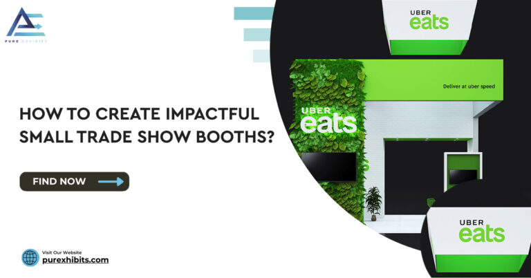
Can a 10×10 booth deliver a meaningful trade show brand experience?
Yes — with the right design priorities. A 10×10 exhibit cannot compete with an island booth on scale, but it can compete on precision, clarity, and visual confidence. The most effective 10×10 brand experiences are built around a single bold headline visible from the aisle, one dominant brand color applied with intention, the highest-quality materials the budget allows, and a clearly defined purpose — one sales conversation, one product, one key message. The trap is trying to replicate the comprehensiveness of a large booth in a 10×10 space, which produces clutter rather than clarity. PureExhibits designs 10×10 exhibits that express brand identity as confidently as larger configurations, by applying the same design discipline at smaller scale.
How long does it typically take to design a trade show brand experience exhibit?
PureExhibits delivers a first 3D concept within 48 hours of the initial design brief. The full design process — from first concept through revisions to approved final design — typically takes one to two weeks when clients can provide brand assets upfront and have a designated approver with decision authority. Design briefs that include Pantone specifications, vector logo files, an approved photo library, and a clear description of the target visitor and the desired brand impression allow the fastest and highest-quality concept development. The total timeline from brief to fabrication complete is eight to twelve weeks for new designs and four to six weeks for returning program clients.
What is the difference between a trade show brand experience and a product display?
A product display shows products. A trade show brand experience creates a designed environment that communicates who the company is, what it stands for, and why a specific type of visitor should care — and uses that context to make product displays more compelling. The difference is the same as the difference between a product placed on a shelf and the same product placed in a curated environment where the shelf, the lighting, the surrounding context, and the brand story all reinforce why this product is worth the visitor’s attention. Most exhibitors build product displays. The companies that consistently generate disproportionate leads from their booth footprint build brand experiences.
How do you evaluate whether your current exhibit is working as a brand experience?
Walk your own booth from 30 feet away and ask four questions: Can you read the primary headline clearly? Does the visual character communicate something specific about what kind of company this is? Does the booth look significantly different from its immediate neighbors? Is there something that makes you want to get closer? If any answer is no, the design is not performing as a brand experience. The second evaluation method is asking qualified visitors who engaged at the booth what they remembered about it 30 days later — specific recall of a visual or experiential element confirms that the design created a distinctive impression; generic recall or no recall confirms that it did not.
How do lighting choices change the perception of a brand at a trade show?
Lighting is arguably the highest-impact low-cost design element in a trade show exhibit. Professional LED wash lighting in the brand’s primary color creates an immersive brand environment that surrounds every visitor interaction with the brand’s visual identity. Directional spotlights on product displays elevate perceived product quality in the same way luxury retail environments use focused lighting to signal premium positioning. Backlit graphic panels create a luminous quality that printed panels cannot achieve and maintain visual impact in the variable lighting conditions of convention center floors. PureExhibits includes a designed professional LED lighting package in every rental as standard — not as an add-on — because the impact on brand perception and visitor experience is too significant to treat as optional.
What is the first step for a company that has never invested in a real trade show brand experience?
The first step is articulating the single most important idea the brand needs to communicate at the shows in your calendar — not a list of products or services, but the one thing that differentiates the company from every competitor on the same aisle and matters most to the target visitor. With that clarity, a design brief can be built, and a 3D concept can be developed in 48 hours. The second step is requesting a concept from PureExhibits — the process of seeing the brand expressed in a three-dimensional exhibit environment quickly surfaces whether the brief is focused enough and whether the design direction is correct. Most companies find that the process of designing the exhibit clarifies the brand’s trade show positioning as much as it delivers a physical exhibit.