
Comwrap Reply · Adobe Summit 2026
A digital experience company can’t hand out a brochure. So the booth became the demo.
At Adobe Summit 2026 in the Venetian Convention & Expo Center, Comwrap Reply walked into a hall where every exhibitor was already an Adobe partner. Pure Exhibits answered with a 20 × 20 custom exhibit: a magenta and violet LED environment built around interactive stations and a live social wall — one that demonstrated the personalised digital experiences Comwrap Reply builds, rather than describing them on a panel.
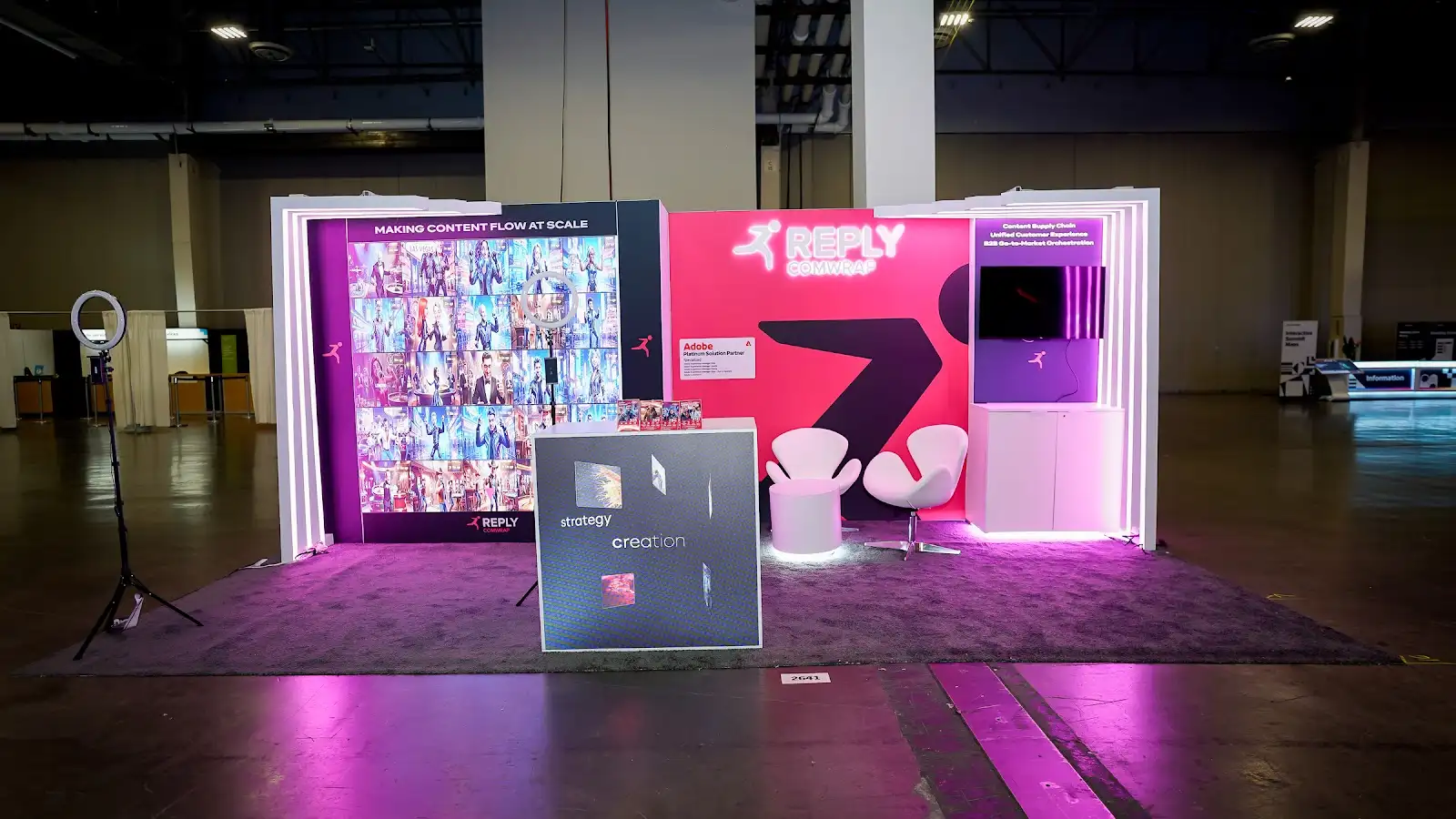
Standing out in a hall where everyone is already an Adobe partner
Adobe Summit is an unusual show floor, because credentials do not differentiate anyone. Every company in the sponsor pavilion is certified, specialised, and fluent in Experience Manager and Real-Time CDP. Comwrap Reply arrived holding genuinely strong cards — Platinum status in Adobe’s Digital Experience Partner Program, a working relationship with Adobe that dates to 2008, and back-to-back Emerging Partner of the Year recognition for Central Europe. But every one of those credentials is a line on a panel that a passing attendee will not stop to read, because the booth next door has a comparable line on its own panel.
The harder problem was geographic. Comwrap Reply is a Frankfurt-headquartered company with offices in Zurich and Vienna, sitting inside a Reply Group of more than 10,000 people worldwide — deeply established in Europe, and only formally launched in North America in early 2025. Adobe Summit is where that North American audience is concentrated for three days. The exhibit had to make a company most of the room had never heard of feel established rather than new, and had to do it in the seconds it takes someone to walk past. Pure Exhibits built the answer around a single decision: stop explaining what Comwrap Reply does and let the booth do it instead.
“Adobe is at the core of everything we do.”Comwrap Reply
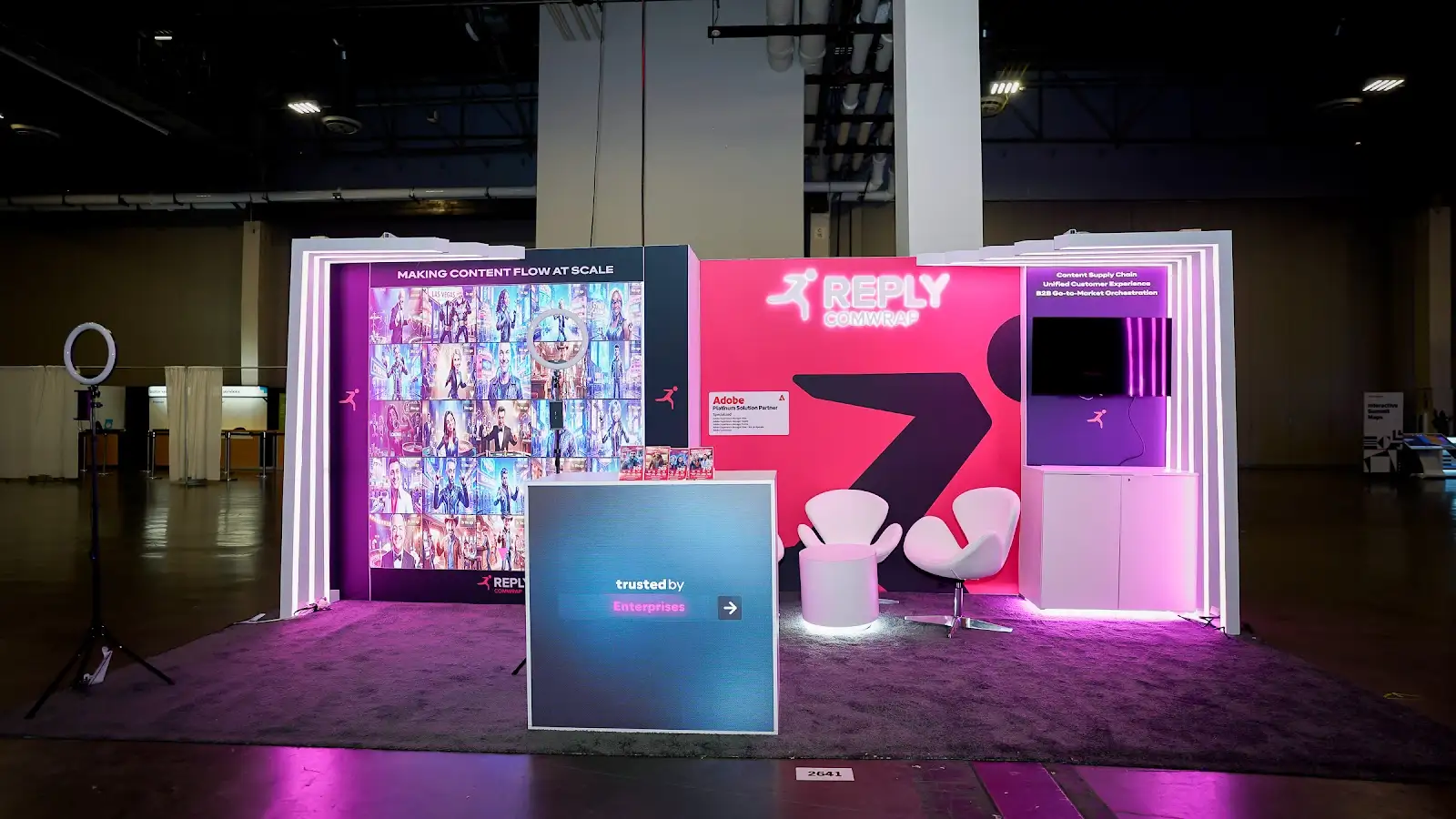
Six decisions that turned a trade show stand into a working demonstration
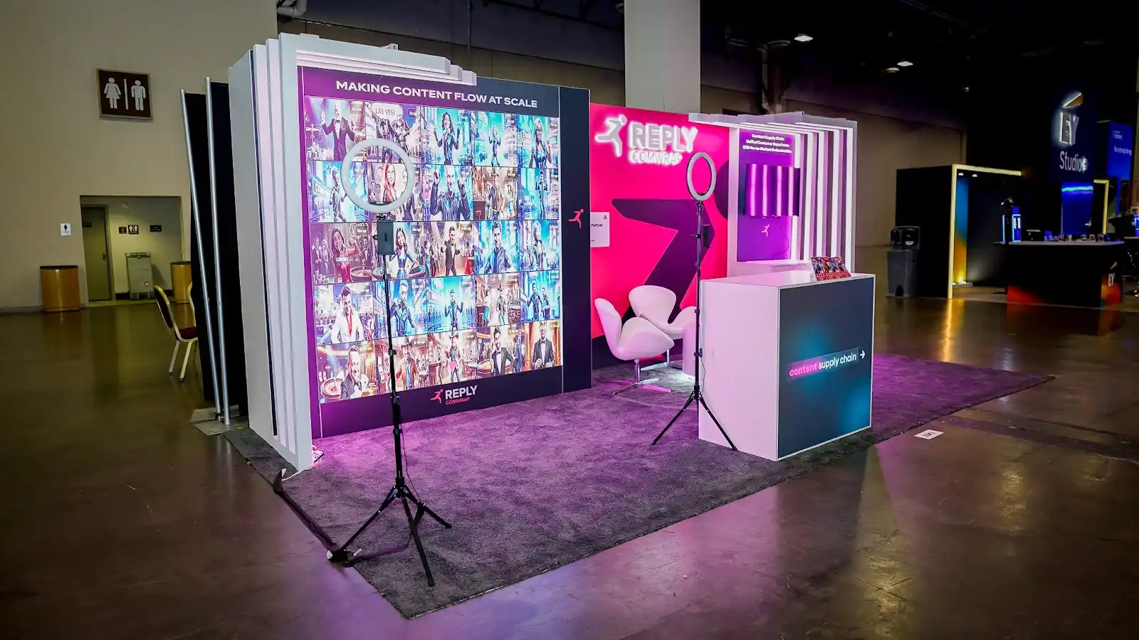
The Booth as the Product
A company selling personalised, real-time digital experiences cannot credibly present itself through printed collateral and a looping video. The central design decision was to put interactive stations at the front of the exhibit rather than tucked behind it, so the first thing a visitor did was operate something. It changed the nature of every conversation that followed: staff were no longer explaining a capability in the abstract, they were standing beside someone already using it.
Magenta as Architecture
Reply’s magenta is one of the more distinctive colours in enterprise technology, and it is usually deployed as a logo on a white wall. Here it became the structure itself — illuminated panels carrying the brand colour at full saturation across the exhibit’s vertical surfaces. On a floor where most sponsor booths default to white, grey, and Adobe red, a magenta and violet light source reads as a landmark rather than a stand, and gives people a way to say where they are meeting.
Lighting That Survives the Venetian
The Venetian Convention & Expo Center has warm, even overhead lighting that flattens printed graphics and washes out screens. Building the brand colour into LED rather than vinyl meant the exhibit generated its own light instead of depending on the hall’s. It held its intensity from the far end of the aisle at ten in the morning and at the end of a long afternoon, which is when most booths visibly lose their edge.
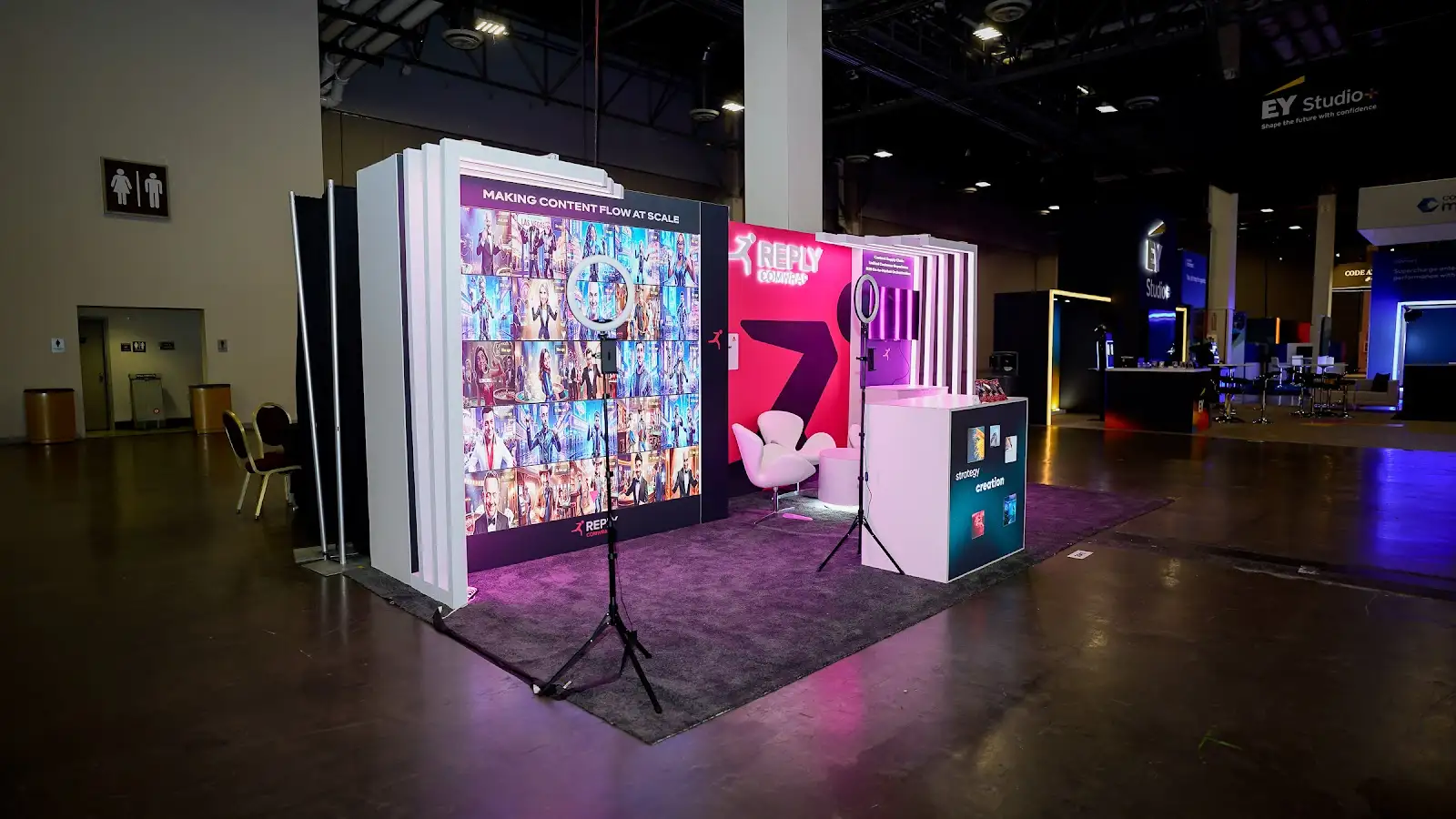
Turning Visitors Into Distribution
A trade show booth reaches the people who walk past it. A social component reaches the people they know. The exhibit carried a dedicated social interaction point designed to give attendees something worth posting from inside the structure — which extended the booth’s reach past the aisle and, for a company still building name recognition in North America, mattered more than another square metre of graphics. It also mirrors the content supply chain work Comwrap Reply delivers for clients.
Reading the Sub-Brand Correctly
Reply operates as a network of specialised companies, which is a real asset and a real wayfinding problem on a show floor. The exhibit had to signal Reply Group scale while making clear that the team inside were the Adobe specialists specifically. The hierarchy was resolved through consistent naming treatment and a single dominant brand colour rather than competing lockups, so an attendee arriving from an Adobe session landed in the right conversation without needing to ask.
Open on Every Approach
Summit attendees move in dense bursts between sessions, arriving from unpredictable directions. The exhibit was laid out with clear sightlines through the structure rather than a single fronted entry, so the interactive stations were visible and reachable regardless of which aisle someone came from. Removing the decision about where to enter removes the most common reason people keep walking.
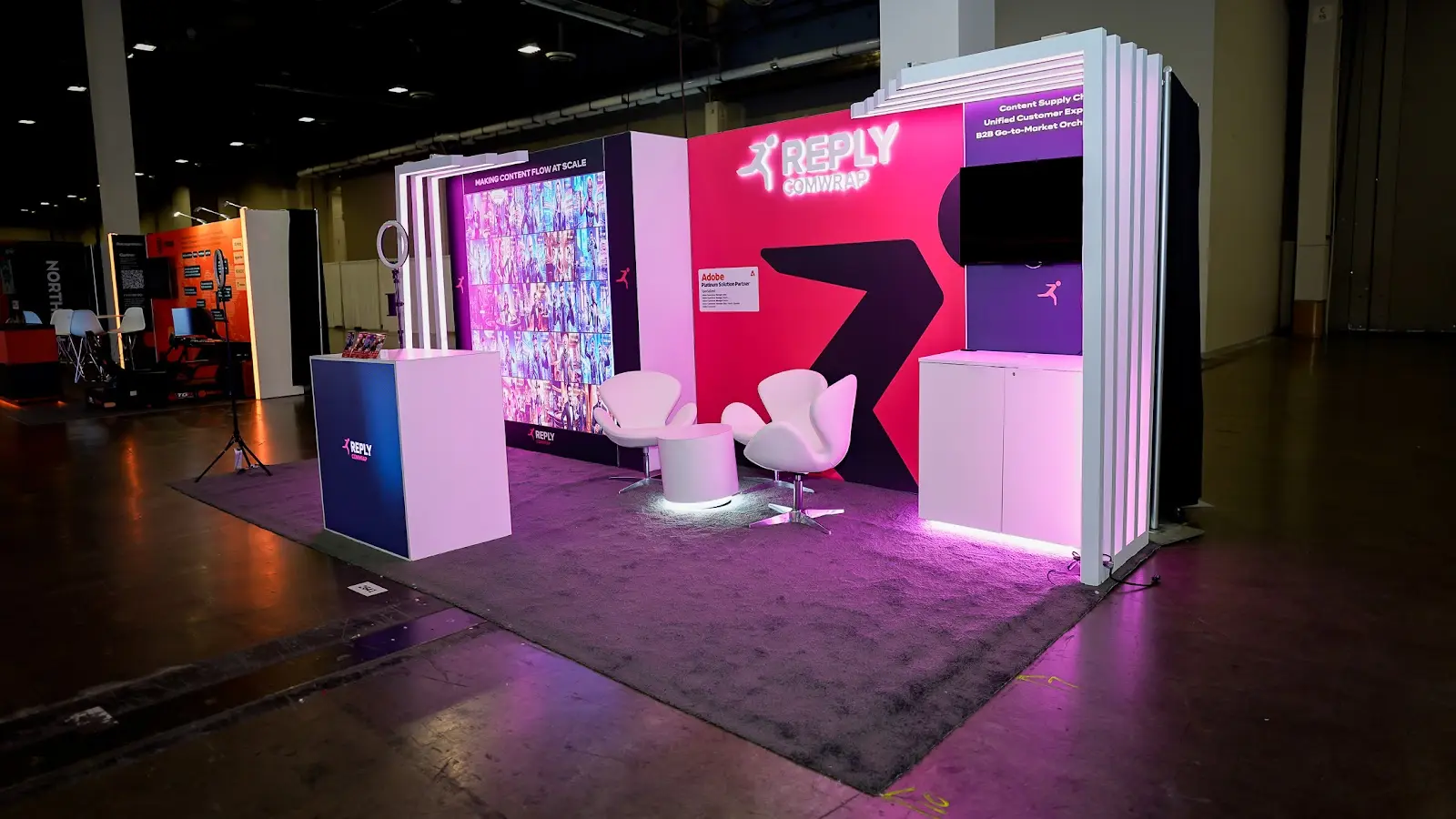
The booth in detail
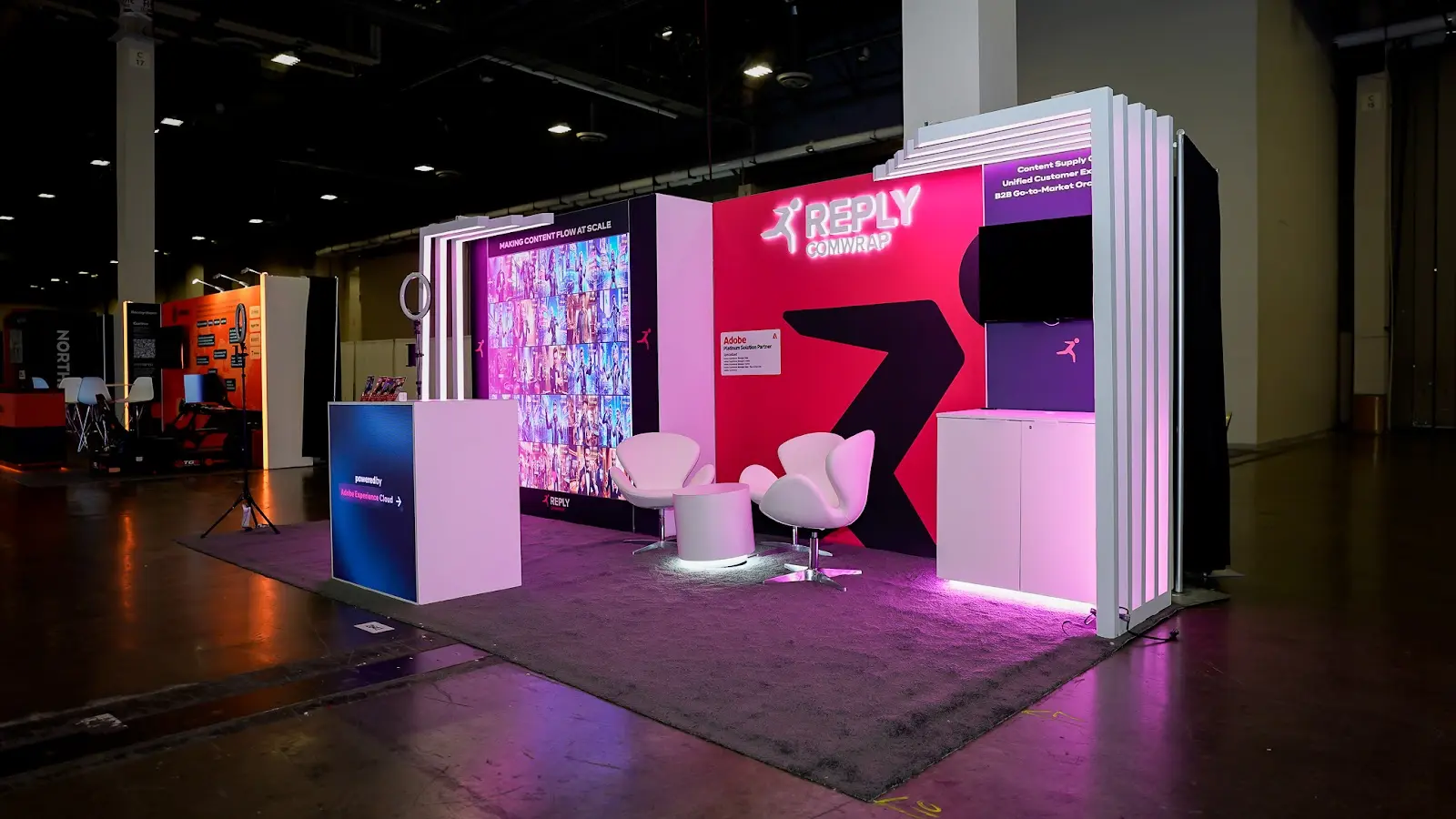
Experience the booth
A walkthrough of the Comwrap Reply exhibit at Adobe Summit 2026 — moving through the illuminated magenta structure, past the interactive stations, and into the social activation point that carried the booth beyond the Venetian Expo floor.
The build at a glance
Making a European Adobe specialist legible to a North American room
Adobe Summit is the one week a year when the entire Adobe Experience Cloud economy occupies the same building — the customers, the product teams, and every partner competing for the same implementation work. For a company that had entered the North American market roughly a year earlier, the objective was not lead volume so much as establishment: leaving the show as a name that a Fortune 500 marketing team would recognise the second time they heard it. That is a memory problem, and memory problems are solved with distinctiveness and participation, not with more copy on more panels.
The week gave the story a useful bookend. During Summit, Comwrap Reply was named winner of the Adobe CXO Emerging Partner Western Europe Award, recognising its work on the content supply chain, real-time personalisation, and B2B go-to-market orchestration — the same three capabilities the exhibit was built to let people touch. A booth that demonstrates rather than describes is a harder brief than a graphics package, and it is the brief Pure Exhibits prefers. For a comparable problem solved for a technology brand with deep credentials and limited floor-level recognition, see the case study on Appdome at RSA 2026.
Explore our tech portfolio
A 20 × 30 island with a large overhead hanging sign, engineered for maximum floor-level visibility in a crowded security market.
View Case Study → RSA 2026 SpyCloudA custom island built to communicate deep threat-intelligence credibility to an audience of security-savvy enterprise buyers.
View Case Study → RSA 2026 RadwareA 20 × 20 island balancing enterprise security authority with a striking, differentiated visual presence.
View Case Study → RSA 2025 TeramindA 30 × 60 Diamond Sponsor island — one of the largest custom installations at the conference.
View Case Study →Let’s build your next booth
Pure Exhibits designs and builds custom trade show exhibits for technology companies, consultancies, and platform partners at Adobe Summit, RSA, NAB Show, CES and beyond. From 10 × 10 inline displays to 30 × 60 island environments, with fixed, transparent pricing and no hidden line items. If you need a booth that does something rather than says something, that is the work we like most.