
VIDEO WALLS · CONTENT STRATEGY · FIELD GUIDE
Your video wall isn’t the investment. The content is.
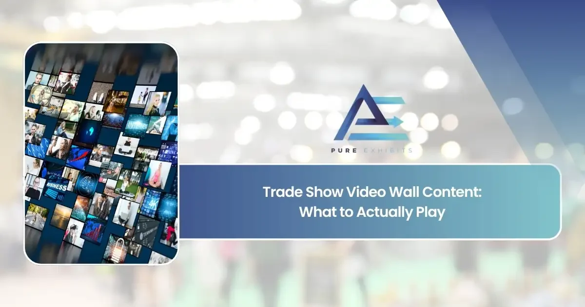
Exhibitors will spend tens of thousands renting an LED wall — and hand it a corporate video with a voiceover nobody will ever hear. This is the complete guide to what should actually play on the wall: the glance physics, the loop architecture, the content types that earn their pixels, and the brief that makes the rental pay. A video wall without a content plan is the world’s most expensive lightbox.
2–5 sec
Average glance
0
People who hear your audio
2–4 min
Ideal loop length
1 claim
Per card, per moment
Video walls have become the default centerpiece of the modern island booth — and for good reason. Nothing else on a show floor commands attention like a wall of bright, moving pixels. But the rental invoice is only half the purchase. The wall is a medium; it arrives empty. What most exhibitors discover three weeks before the show is that they’ve budgeted five figures for the screen and nothing — no money, no calendar time, no owner — for the thing people will actually look at. The result is predictable: the sizzle reel from last year’s sales kickoff, stretched to a resolution it was never made for, playing audio into a hall that swallows it whole.
This guide is about closing that gap. It follows the same logic as our booth messaging guide — distance, hierarchy, budgets — applied to the one surface on your booth that moves.
01 · The Physics
Nobody watches a video wall. They glance at it.
The fundamental error in most video wall content is assuming an audience. There isn’t one. There is a river of people moving past at walking speed, each giving your wall two to five seconds of attention — and they arrive at a random moment in your loop, not at the beginning. That single fact rewrites every content rule you know from film and web video: no narrative arc, no setup-and-payoff, no “wait for it.” Every second of the loop must work as a first second.
Watch the wall below for fifteen seconds. It never depends on where you started — each card is complete, one claim at a time, big enough to read mid-stride. That is the entire discipline:
“`ACME LEARNING
Every student a creator
The claim — 4 words, one breath
ACME LEARNING
40,000 schools. One platform.
The proof — a number that stops feet
ACME LEARNING
See it live — demos every 30 min
The action — one ask, with a time
A three-card message cycle — claim → proof → action — readable from any entry point
Design for the glance. Reward the stare. Never require the stay.
02 · The Content
What content is actually worth the pixels?
Ranked by how hard each type works on a real show floor:
“`01 · The Landmark Layer
Ambient brand motion
Slow, textural, brand-colored motion — abstract loops, macro product textures, gentle particle fields. This is the wall’s resting state and its wayfinding job: from a hundred feet, it makes your booth the brightest, most alive object in the sightline. It says nothing, deliberately. Its job is to be found, and found again on day three.
02 · The Message Layer
Big-type claim cards
Your booth messaging hierarchy, animated: one claim per card, five to ten words, held on screen long enough to read twice. This is where the wall earns conversations — a passerby reads “40,000 schools. One platform.” mid-stride and slows down. Type must be enormous: if it wouldn’t work printed at the same size, motion won’t save it.
03 · The Proof Layer
Numbers, logos, and one great quote
A counter ticking to your headline statistic, a cycle of five recognizable customer logos, a single short quote with a real name. Proof on a video wall benefits from motion in a way static panels can’t match — a number that counts up gets read; the same number printed gets skipped.
04 · The Product Layer
The product doing its thing — not its interface
Show outcomes, not screens: the machine running, the classroom creating, the before-and-after. UI recordings die at distance — menus and cursors are 3-foot content on a 30-foot surface. If software is the product, show what the software produces, shot like footage, not captured like a tutorial.
05 · The Live Layer
Scheduled takeovers
The wall as theater backdrop for scheduled presentations and demos — the only mode where an actual audience exists and longer-form content is earned. Announce the next session on the loop itself (“demos every 30 min”) so the passive wall sells the live one.
03 · The Kill List
What should never run on the wall?
Every one of these appears on show floors daily, and every one wastes the rental:
“`Sound is dead on a show floor. Design silent-first, and the wall works everywhere — including the one place it lives.
04 · The Architecture
How do you structure the loop?
Think of the loop as a broadcast schedule compressed into three minutes. Ambient landmark motion is the default state; message cards surface on a rhythm; proof and product moments punctuate. A passerby catches any thirty-second slice and gets at least one complete claim; a stopper who stays ninety seconds gets the whole argument. Here is a three-minute loop that does it:
“`Loop length: two to four minutes. Shorter, and your staff hear the same sting two hundred times a day and the wall reads as repetitive to anyone who lingers. Longer, and your key claim surfaces too rarely — a message card should recur roughly every forty-five to sixty seconds. And consider dayparting: a calmer, landmark-heavy loop for slow hours, the full message rotation for peak traffic, and the takeover mode for scheduled demos. One wall, three programs.
05 · The Budget
How long should each card hold the screen?
The rule for on-screen text: hold it long enough to be read twice, because your reader started mid-card. Budgets per content moment:
“`Motion serves legibility, never fights it: text arrives, settles, and holds still while it’s being read — animate the entrance and exit, not the reading. And the distance math from print still applies, amplified: on a wall viewed from thirty feet, headline type should be at least a foot tall on the physical surface. Check your renders at real-world scale, not on a laptop.
One more placement rule: QR codes generally don’t belong on the wall itself — it’s too far and too high to scan. The wall creates the stop; the scan lives on a counter or kiosk at hand height, three steps away, carrying the same offer the wall just made.
06 · The Practicalities
What do you need before content production starts?
Four numbers from your exhibit house, in writing, before anyone opens After Effects: the wall’s physical dimensions, its native pixel resolution (LED walls are rarely 16:9 — a 20-foot × 8-foot wall is 2.5:1, and content must be built to it), its pixel pitch (which sets the minimum comfortable viewing distance and therefore your minimum type size), and the playback system and file spec it accepts. Ask for a template file at native resolution with safe areas marked. Then build once, at native size — upscaling a 1080p asset onto a 4K-wide wall is how crisp brands end up looking soft.
“`The content brief — one page, signed before production
Exactly like the booth message brief, the wall gets its own: the one claim the loop exists to deliver; the card list with copy finalized (word budgets enforced); the loop map with timings; the proof assets and their sources; the dayparting plan; the native-resolution spec; and a named owner for content sign-off. Production estimates against this brief are accurate; production without it becomes the sizzle reel again, three weeks before the show.
The wall rental is the fixed cost. The content is the variable that decides whether it was a landmark that filled your pipeline — or a very bright, very expensive screensaver. Budget for the pixels’ worth of thinking, not just the pixels.
Questions
Video wall content, answered
What content should play on a trade show video wall?
A two-to-four minute silent loop built from five layers: ambient brand motion as the landmark resting state, big-type claim cards of five to ten words, proof moments (one statistic, customer logos, a short quote), product footage showing outcomes rather than interfaces, and announcements for scheduled live demos. Every moment must work for a viewer who arrives mid-loop.
Should a trade show video wall have sound?
No. Show floors run 75–85 decibels and audio is inaudible a few feet from the source. Design silent-first: no voiceover dependence, captions burned in for any talking heads, and all meaning carried visually. Sound is reserved for scheduled theater presentations with a gathered audience.
How long should a video wall loop be?
Two to four minutes. Shorter loops feel repetitive to anyone who lingers and exhaust your own staff; longer loops surface your key message too rarely. A claim card should recur roughly every 45–60 seconds, and text should hold on screen long enough to be read twice.
Can you play a normal corporate video on a video wall?
It almost always fails: corporate videos assume a seated viewer at minute zero with working audio. On a wall they lose their narrative, their sound, and usually their aspect ratio. Recut the footage into silent, self-contained 15–30 second moments built at the wall’s native resolution instead.
Should you put a QR code on a video wall?
Generally no — walls sit too far away and too high to scan comfortably. Let the wall create the stop and state the offer, then place the QR code on a counter or kiosk at hand height nearby, carrying the same offer with a stated reward and time cost.
What specs do you need before making video wall content?
Four numbers in writing from your exhibit house: physical dimensions, native pixel resolution (LED walls are rarely 16:9), pixel pitch (which sets viewing distance and minimum type size), and the playback file spec. Build content once, at native resolution, using a template with safe areas marked.
Rent the wall and the plan
Pure Exhibits designs and builds custom booths with LED walls sized, specced, and content-planned as one decision — fixed pricing, nationwide, 100% pre-built before shipping.